![]() Chicago Bears Logo PNG
Chicago Bears Logo PNG
Modern minimalism is found in the logo of the Chicago Bears, a club that represents Chicago in American football. The design of the bear head is not just a striking visual image; it carries a deep meaning for the franchise. The blue and orange colors are linked to the team’s long-standing traditions, and the bear head symbolizes strength, ferocity, and resilience. The new Chicago Bears logo, reflecting the team’s hometown and the animal after which it is named, captures the essence of the team and serves as a bold statement of its identity and aspirations. The shift to using the bear head as the primary logo marks an important milestone in the team’s history and should resonate with both new fans and long-time supporters.
Chicago Bears: Brand overview
| Founded: | September 20, 1919 |
| Founder: | Virginia Halas McCaskey |
| Headquarters: | Chicago, Illinois, U.S. |
| Website: | chicagobears.com |
The Chicago Bears are a professional American football team in the National Football League’s Northern Division. Their history began in 1919 when the A. E. Staley Food Starch Manufacturing Company founded its football club in Decatur, Illinois. George Chamberlain, the company’s chief manager, wanted their club to keep up with the best semi-professional teams. He invited George Halas and Edward Sternaman to lead the franchise.
In 1920, the two celebrated coaches began training the Decatur Staleys. In 1921, they gained full control of it. They managed to buy the franchise rights from A. E. Staley for $5,000 and move it from Decatur to Chicago. According to the agreement, the original name was not to change for one season.
In 1922, the Chicago Staley received a new name. At that time, the football players shared Wrigley Field stadium with the baseball team Chicago Cubs (a cub is a bear cub). Regarding the team’s name, the franchise owners decided to stick to the “bear” theme. Hence, the team changed its name to the Chicago Bears. As for the color scheme, George Halas borrowed colors from the University of Illinois in darker shades of blue and orange.
Financial difficulties began after the championship season of 1932 forced Edward Sternaman to sell his shares. Being the sole owner of the franchise, George Halas completely controlled it until his death in 1983. After his death, the Bears were inherited by his eldest daughter, Virginia McCaskey. Now, the McCaskey family owns 80% of the franchise; Patrick Ryan and Andrew McKenna, the executive chairman and director of Aon Corp., respectively, own 19.7% of the club’s shares.
Meaning and History
![]()
The Chicago Bears had six official logos throughout their 100-year history. Two of them featured the image of a bear. The seventh version, unveiled in 1993, has never been used. For all their love of redesigns, the Chicago Bears are conservative because they still use the 1974 logo. The management felt that the orange thymus-shaped C was a good idea of the club’s vision. The 1993 version did not catch on, although the artists supplemented it with a bear, considered the football players’ mascot.
The bear was depicted on the Chicago Bears emblems from 1940 to 1973, even though the team was created in 1920. In the early years, it used its sponsor, Decatur Staleys, and then – its logo with a ball and the words “Staleys “(The then nickname of the club).
What is Chicago Bears?
The Chicago Bears are the most successful franchise in the National Football League, a record holder for the number of matches won and a multiple winner of division, conference, and league championships. In 1985, they won the “Vince Lombardi Trophy” at the Super Bowl. From its founding in 1920 until 1922, it changed several names: it was first known as the Decatur Staleys, then as the Chicago Staleys.
1920
![]()
The first logo was introduced in 1920. Since Decatur Staleys belonged to the A. E. Staley Company used the sponsor’s logo. It was a well-thought-out marketing decision to attract public attention to the production of food starch.
The logo looked like a circle divided into two equal horizontal parts. The circle was cut with a double contour. In the upper half was the letter “S” written in blue on a dark orange background. The white inscription “Staleys Decatur” contrasted with the blue background of the lower semicircle. The lexical sign “Staleys” was written in uppercase print letters. The lexical sign “Decatur” imitated handwritten font: the letter “D” was uppercase, while the rest were lowercase.
1921
![]()
After moving to Chicago and renaming the Chicago Staleys, the team developed a new logo. Elements indicating the A. E. Staley Company was removed, as the main focus was on the sports concept. The logo included a light brown, black-outlined American football with the inscription “1920” in the center (the franchise’s founding date). Below was the word “Staleys” in orange with a blue outline. The font was uppercase with small serifs.
1940 – 1945
![]()
The team acquired its current name, “Chicago Bears,” in 1940, and that’s when their first logo appeared. It depicted a black bear with a football in its paw. The bear, running on its hind legs, symbolizes a strong and invincible player.
1946 – 1973
![]()
In 1946, the logo was replaced with a new one – a football with a dark blue bear lying on top of it and clinging to it. The bear was not as detailed as in the previous logo. The animal was depicted more schematically: white lines on a dark blue background outlined the body’s curves. Sharp claws, lowered eyebrows, and an open mouth made the image quite aggressive. A neat white line bordered the dark orange football with blue outlines.
1962 – 1973
![]()
In 1962, the prototype of the current bear logo appeared on helmets. It was a white “C” bone of wishes with a black outline. The bone of wishes is a symbol of luck. The earliest known use of the “C” was by the University of Chicago in 1898. The Cincinnati Reds have worn this emblem on their caps home and away since the 1960s. There is even a long dispute about who first stole this logo: the “reds” or the “bears.”
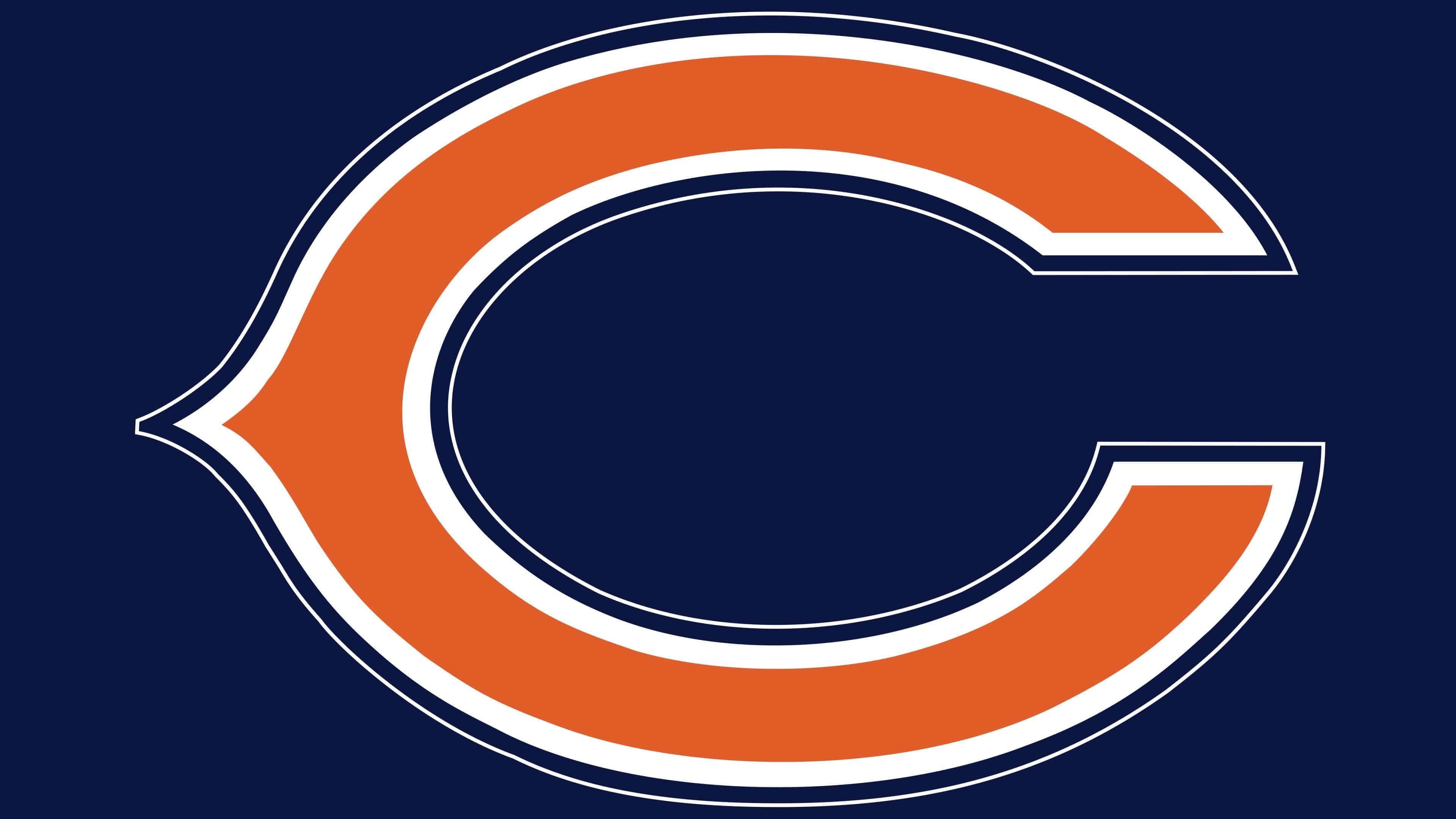
1974 – 2023
![]()
The main element of the “Chicago Bears” image is the stylized letter “C” from the city’s name. Until 1973, it was white with a broad blue outline. In the current version, designers added another color – orange. The dark mandarin orange letter “C” is now surrounded by a white line on all sides and has the same blue outline as in the previous version. Orange represents energy, optimism, and happiness; white – represents purity and elegance; black – represents superiority and perseverance.
From 1973 to 2023, the letter “C” in a particular logo underwent four variations of the orange shade – a subtle evolution that can be considered a redesign. Here’s a detailed analysis of this seemingly minor but important change in branding.
Over five decades, the main structure of the logo remained unchanged: a simple letter “C.” This design choice speaks of stability, tradition, and recognizability. Maintaining this element over many years has allowed the brand to retain its identity while subtly adapting to the times.
Four different shades of orange marked the evolution of the logo. These changes were not radical; they were subtle adjustments reflecting nuances in branding changes or even cultural tastes.
- First shade (1973-1981): The original shade introduced in 1973 might symbolize the beginning of a new era or the adoption of a certain aesthetic prevalent at that time.
- Second shade (1981-1996): A slight change in color, possibly reflecting changes in design trends or new marketing strategies.
- Third shade (1996-2001): This third variation might have been caused by technological advances in printing or screen printing, allowing for a more refined and vibrant color.
- Fourth shade (2001-2023): The most recent shade may embody contemporary design principles, reflecting modern tastes and meeting current branding standards.
What makes this evolution intriguing is how imperceptible it is to the casual observer. If you don’t view all the variants together, it might seem like the logo has remained unchanged all these years. Such subtlety in design reflects a masterful understanding of brand identity, ensuring continuity and familiarity while allowing for development and adaptation.
This case highlights the significance of color in branding. Despite its seeming insignificance, the precise shade of color can carry a special subtext and emotional resonance. By subtly changing the shade, a brand can signal changes or more closely associate itself with certain values without alienating its existing audience.
1993
![]()
In the 1990s, the Chicago Bears experimented with alternative logos. One of the unused versions was a white and blue head of a roaring bear. It was placed over an orange letter “C” with a thick blue outline.
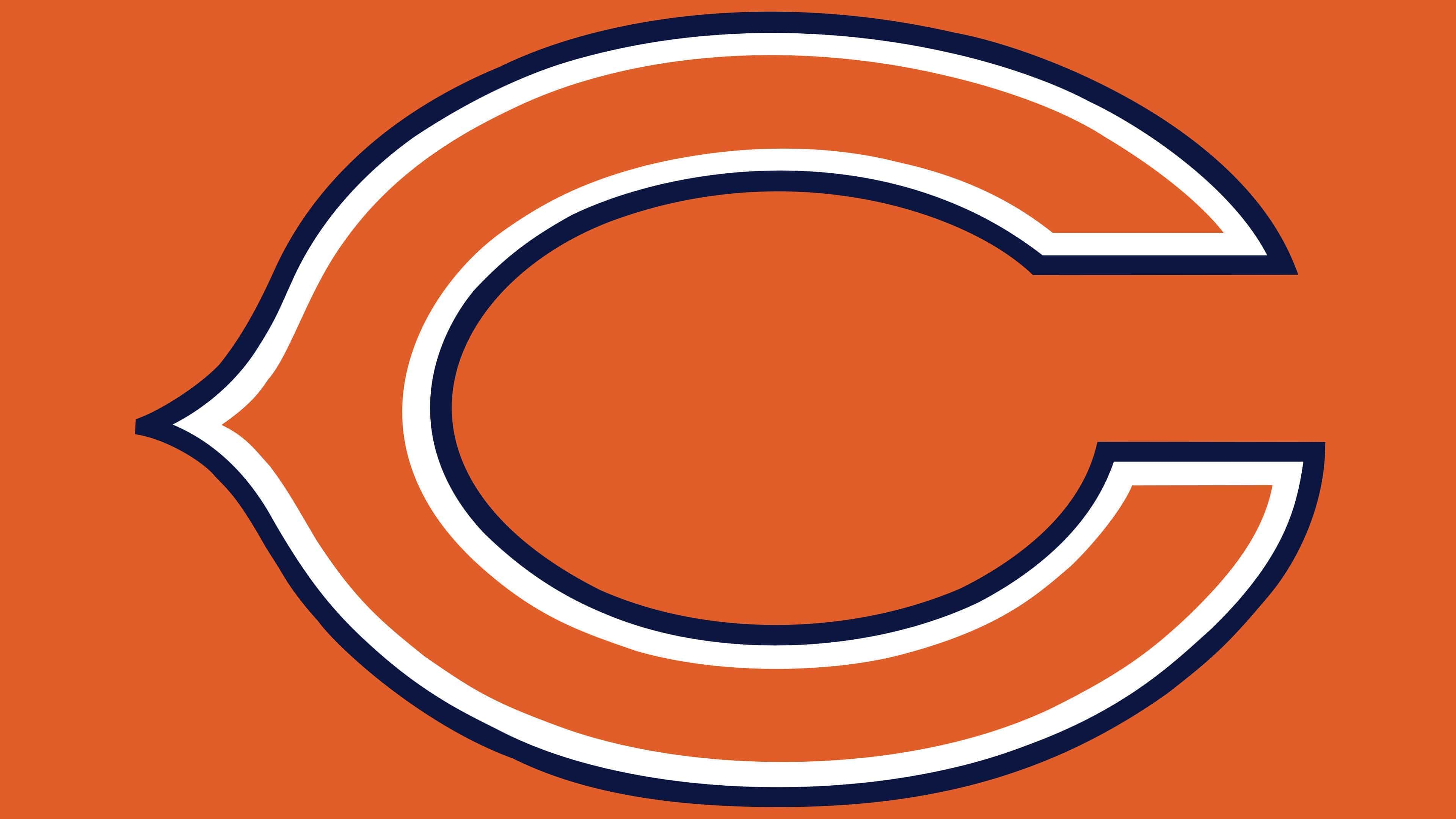
2023 – today
![]()
The blue-orange logo with the bear’s head, which was previously one of the main ones along with the iconic “C” logo, has now become the team’s standalone primary logo. This transition marks a new chapter in the “Bears'” visual identity, aligning with contemporary design aesthetics while maintaining the traditional colors long associated with the team. The bear’s head design embodies the team’s fierce and competitive nature and symbolizes a fresh look into the future.
Chicago Bears: Interesting Facts
The Chicago Bears are an old and famous National Football League (NFL) football team. They’ve been around since football started in America.
- How They Started: In 1919, a company called A.E. Staley started the team in Decatur, Illinois. They moved to Chicago in 1921. Along with the Arizona Cardinals, they’re one of the first teams in the NFL.
- George Halas helped start the NFL and was super important to the Bears. He did everything for the team—played, coached, and owned it—until he passed away in 1983. People called him “Papa Bear” because he meant so much to the team.
- Soldier Field: They’ve played their games at Soldier Field since 1971. It’s a famous stadium that was fixed up in 2003. It looks old on the outside but has all the modern stuff fans need on the inside.
- Super Bowl Win: In 1985, the Bears won the Super Bowl by beating the New England Patriots 46-10. That team from 1985 is thought to be one of the best.
- “Monsters of the Midway” was a nickname for the Bears in the 1940s because of their strong defense. Although originally a nickname for the University of Chicago football team, it fits the Bears perfectly.
- Lots of Records: The Bears have more players in the Pro Football Hall of Fame and more retired jersey numbers than any other team. They’ve also won more games than any other team.
- Gale Sayers and Brian Piccolo: Their friendship became famous through the movie “Brian’s Song.” Brian Piccolo had cancer, and their story showed how they supported each other, no matter their race, during a time when that wasn’t common.
- Biggest Win: In 1940, they won an NFL Championship game 73-0 against the Washington Redskins, the biggest win ever. That game showed how good the T-formation offense was.
- Rivalries: Their biggest rivalry is with the Green Bay Packers. It’s one of the oldest rivalries and is intense, starting back in 1921.
- Changing the Game: The Bears helped change how football is played. George Halas helped come up with practicing every day, watching game films to improve, and using the T-formation in games.
The Chicago Bears have been a big part of the NFL for a long time, with great players, big wins, and new ways of playing football.
Font and Colors
The club’s logo consists of only one element – a large letter “C” with a sharp protrusion on the left. The triangle located in the center of the rounded part gives it the shape of a thymus bone, which is considered a great luck that can be found on Thanksgiving Day. Whether the “Chicago Bears” are superstitious or it’s just a coincidence, such an interpretation makes the emblem a symbol of the team’s success.
The club’s trademark is essentially a nod to the city’s name. It contains only one letter without additional text. The letter “C” is not written but drawn, so there can be no talk of a font. The artists gave it individuality by adding a pointed angle on the left side. At the same time, the letter is elongated horizontally, which collectively makes it resemble the thymus bone of a bird.
The color scheme is maximally simple: an orange center combined with a white inner outline and an outer dark blue outline. The chosen combination corresponds to the palette of the Chicago Bears club.
Chicago Bears color codes
| Bears Blue | Hex color: | #0b162a |
|---|---|---|
| RGB: | 11 22 42 | |
| CMYK: | 100 60 0 80 | |
| Pantone: | PMS 5395 C |
| Bears Orange | Hex color: | #c83803 |
|---|---|---|
| RGB: | 200 56 3 | |
| CMYK: | 0 75 100 0 | |
| Pantone: | PMS 1665 C |
FAQ
What does the “Black Bears” logo mean?
The logo of the Maine Black Bears team, representing the University of Maine, has no hidden meaning. It simply represents the name of the sports organization: the blue word MAINE is written in the background, and an image of an enraged bear’s head is in the foreground.
What bear is depicted on the Chicago Bears logo?
Fans speculate that the Chicago Bears logo features a grizzly bear or a close relative of the brown bear. These species are similar to each other but not identical.
Why is the “Chicago Bears” logo AC?
The “Chicago Bears” do not have a logo with the inscription “AC” – they use a sign with a single letter “C.” This denotes the city where the club is based. There are rumors that the design of the letter “C” was copied from the “Chicago Cubs.”
How many Super Bowls have the “Bears” won?
As of 2021, the “Chicago Bears” have won only one Super Bowl. This happened in 1985 and was the team’s most resounding victory.