![]() Chicago White Sox Logo PNG
Chicago White Sox Logo PNG
The Chicago White Sox logo confuses like a deceptive trick of baseball players who want to mislead their opponents with unpredictable maneuvers. The three letters convey a multitude of diverse emotions: aggression, determination, strength, and unity. Additionally, the dynamic symbol is very assertive and impregnable – just like the team it represents.
Chicago White Sox: Brand overview
| Founded: | 1900 |
| Founder: | Jerry Reinsdorf |
| Headquarters: | Chicago, Illinois, U.S. |
| Website: | mlb.com |
The Chicago White Sox is a professional baseball team that is part of the MLB. The team is in the AL Central Division and was established in 1890. The Chicago White Sox is based in Chicago, Illinois.
The club’s founder is Charles Comiskey. The legendary athlete and one of the founders of the American Baseball League was also an excellent manager, successfully managing the franchise until 1931. It soon passed to his heir, Louis Comiskey, and then to Grace Comiskey. The team alternately belonged to them until 1956.
After that, it immediately had two owners – Dorothy Comiskey Rigney and Chuck Comiskey. In 1958, Bill Veeck became the owner of the club. Then, the team was bought by Arthur and John Allyn. Their management continued until 1975. In 1981, Jerry Reinsdorf acquired it from Aaron Kushman for 19 million dollars. After the deal, he signed contracts with Greg Luzinski and Carlton Fisk, strengthening the lineup.
The franchise’s original name was “Chicago White Stockings.” However, sports editors at the Chicago Tribune began abbreviating it to Chicago White Sox after bombardier Christopher Hynes wrote it as such on a scorecard. The club officially got its new name in 1903.
After joining the MLB, the Chicago team changed the design of its official logo no less than 20 times. These were various modifications, from several lettered writings to a graphic image of a white sock with a golden eagle. But only one version confidently survived all changes.
The modern logo most resembles the emblem from 1932-1935. It looks like a downward and slightly tilted inscription “SOX.” The font Gotham Bold is done in a medieval style. This creates an interesting play of contrasts because, if you look closely, the object is drawn as if it says “SEX.” The play on words was brought by the diagonal placement and Old English elements.
The main colors of the brand name are a combination of black and white. The letter outlines are traced in silver. In addition, the letter “S” is made more figurative, with a notch at the top and an elongated “tail” at the bottom.
Meaning and History
![]()
Since the founding of the Chicago White Sox team, it has had nineteen logos. The very first one dates back to 1901. It opened the era of separate symbols with the letter “S,” which was used for seven seasons. Then followed the transformation of the text with an emphasis on “S” and two internal symbols – “o” and “x.” There were only four graphic versions; the rest were a harmonious combination of drawn and printed elements.
What is Sox?
Sox is the abbreviated name of the American baseball team Chicago White Sox, which has existed since 1900. It was named after its location and was originally called Chicago White Stockings. The club was among the first eight charter franchises and now represents the Central Division of the American League in the MLB. Its home stadium is Guaranteed Rate Field.
1901 – 1902
![]()
The first logo of the “White Stockings” was a red print of the letter “S.”
1903
![]()
The last logo of the “White Stockings” club was a blue letter “S,” resembling two inverted stockings.
1904
![]()
The team changes its name to “Chicago White Sox.” The logo again represents the old English letter “S” in blue. Emphasis is added to the middle of the letter “S,” and the shape itself becomes more elongated.
1905
![]()
A year later, the logo changes again, but these changes are minor. A white diamond is added in the middle of the letter to emphasize the center of the letter and its shape.
1906 – 1907
![]()
The “White Sox” changes its logo to a more rounded letter S, again dark blue. The letter has a small hook at the top and a straight cut at the bottom.
1908 – 1909
![]()
This time, two triangles are added to the middle of the previous image.
1910 – 1911
![]()
The “White Sox” logo of 1910 has an even more rounded shape. The color remains the same, and the only detail added is a hook at the top of the letter.
1912 – 1916
![]()
In 1912, the “White Sox” debuted with one of the most recognizable logos in the history of baseball. Its basis is the capital letter “S,” with a small letter “o” at the top and a small letter “x” at the bottom, thus forming the team’s name – “Sox.” The logo’s color is entirely dark blue.
1917
![]()
Minor changes were made to the previous club logo. Thus, the letter “S” became more elongated and thin, and the letters “O” and “X” – were more elongated in height.
1918 – 1931
![]()
In the background, there is an American flag, a golden eagle, and a golden circle with the inscription “Worlds Champion. White Sox.” Just below are two crossed golden baseball bats, a small white baseball, and in the center is a white sock. Under the drawing is the inscription “Chicago,” done in blue.
1932 – 1935
![]()
The basis for the eleventh logo was the word “SOX” in red, positioned diagonally from left to right. Inside the letter “O” is a white baseball, and in the background is a drawing of a yellow baseball bat.
1936 – 1938
![]()
The creators of the logo returned to the design of 1912. They only slightly changed the font of the letters, but their arrangement remained the same. Additionally, the club returned to its original dark blue color.
1939 – 1948
![]()
In 1939, the logo featured an animated version of a baseball player dressed in a shirt with the inscription “White Sox.” In the background is a large red and white baseball.
1949 – 1959
![]()
In the late 50s, the “White Sox” changed the logo again. The logo featured a white sock with wings flying through the air, through the wind, and clouds. The inscription “Chicago” is done in the foreground in red, additionally outlined by a thin blue contour.
1960 – 1975
![]()
The new club logo features an image of a white sock on a red circle in the background. Over the sock, the contour of a baseball player swinging a baseball bat is drawn.
1976 – 1981
![]()
The sixteenth logo of the “White Sox” is based on a drawing of a baseball player hitting a red ball with a blue bat. At the bottom of the logo, the inscription “Chicago White Sox” is placed, divided by red lines. The word “Sox” is positioned slightly higher in blue.
1982 – 1986
![]()
1987 – 1990
![]()
A decade later, the logo hardly changes. Among the minor adjustments is the change of blue shade to a more intense dark.
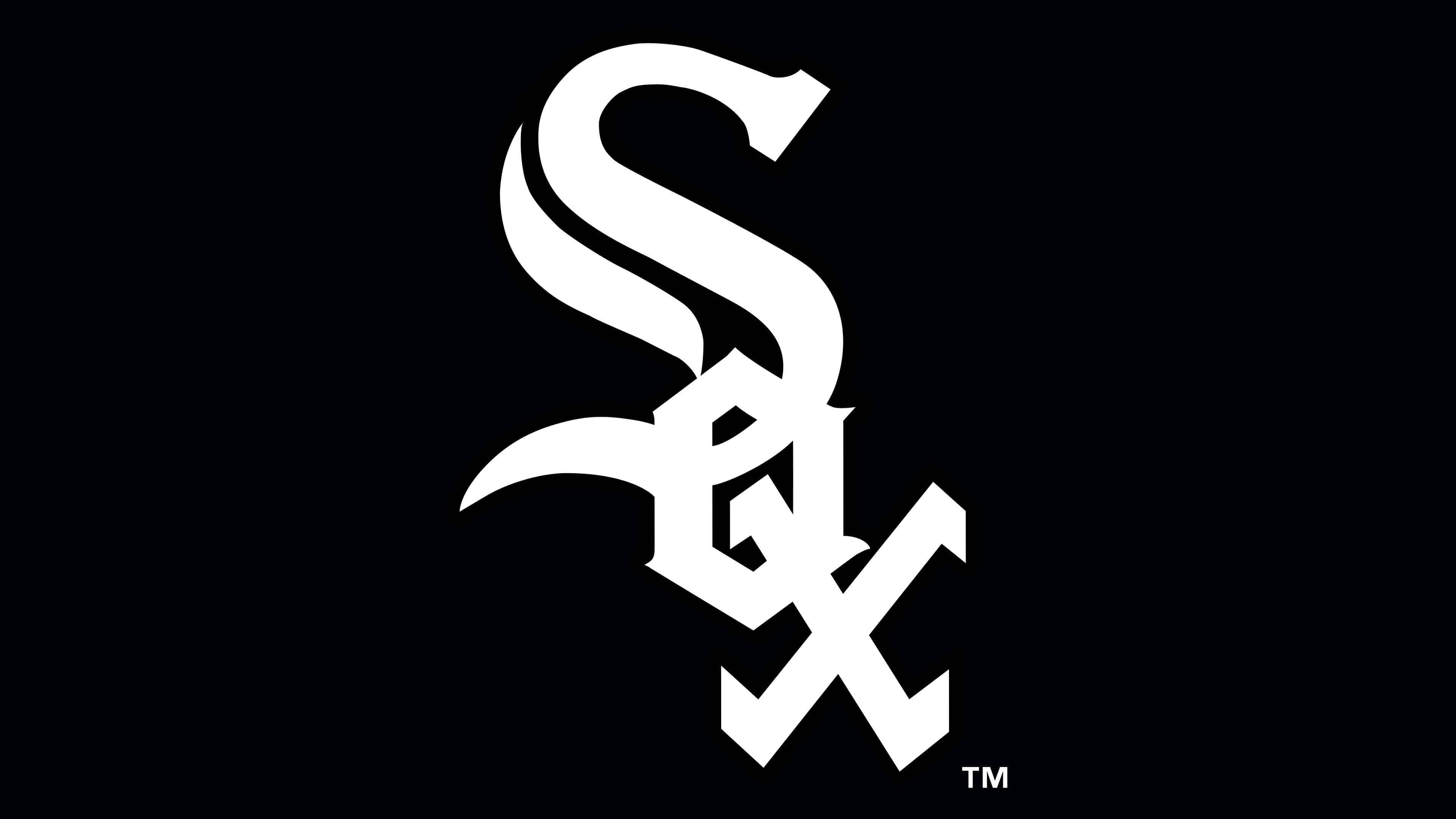
1991 – today
![]()
The modern version became an artistic reinterpretation of the emblem in 1912 when the image of the capital letter with two small symbols inside was first proposed. In this case, they are positioned diagonally and read from top to bottom. In the sports world, this emblem is associated with scandal because it is believed that the designer intentionally made the letter “o” similar to “e,” giving the word “Sox” a completely different meaning. Despite the discrepancies, the management decided to keep the ambiguous symbol to draw attention to the club’s name. Thus, the current version appeared – a stylized inscription without a graphic part.
Chicago White Sox: Interesting Facts
The Chicago White Sox are a famous baseball team with a lot of history.
- How They Started: They began as the Sioux City Cornhuskers in 1894, became part of the American League in 1900, and moved to Chicago in 1901, where they got the name White Sox.
- First Big Win: In 1906, they beat the Chicago Cubs in the World Series, even though they didn’t hit many balls. Their pitchers were good.
- A Big Scandal: In 1919, some White Sox players were paid to lose the World Series on purpose. This was a huge scandal, and those players were banned from baseball forever.
- The Go-Go Sox: In 1959, the White Sox, known for being fast, won the American League. They also played in the World Series but lost to the Los Angeles Dodgers.
- Breaking Barriers: In 1951, Minnie Miñoso became the first black player in the American League to play for the White Sox. He was great and became very popular.
- Winning Again: After 88 years, the White Sox won the World Series in 2005 by beating the Houston Astros. Their pitchers were amazing.
- Their Ballpark: They play at Guaranteed Rate Field, known for its cool scoreboard that shoots fireworks when the White Sox hit a home run.
- Home Run Fireworks: Their scoreboard was the first to shoot fireworks for home runs, a fun thing other parks do now, too.
- Four Home Runs: In 2008, four White Sox players hit home runs one after the other in one game. That’s pretty rare.
- Perfect Games: The White Sox pitchers threw perfect games in 2009 and 2012, which means no one from the other team got on base.
The White Sox have done a lot in baseball, like winning big games, having great players, and being the first to do some cool things.
Font and Colors
The franchise owners did not go the beaten path and did not use the image of socks in the team’s symbolism. Renaming themselves, they took the name for the logo in its current form – as an inscription. The word is short, consisting of just three symbols, and looks beautiful on baseball paraphernalia.
This is a textual emblem, so the artists paid great attention to the verbal part. They skillfully combined graphics and text, choosing an Old English font reminiscent of Gotham Bold for the inscription. The letters are arranged in three levels: the upper – “S” (with a double line and elongated tail), the second – “O” (with rectangular angles), and the lower – “X” (with characteristic serifs).
The logo’s palette includes all the franchise’s primary colors – black, silver, and white. The letters are written first, the second serves as the background and divides half of the bend of the first symbol, and the third acts as a frame.
Chicago White Sox color codes
| Black | Hex color: | #000000 |
|---|---|---|
| RGB: | 0 0 0 | |
| CMYK: | 0 0 0 100 | |
| Pantone: | PMS Process Black C |
| Silver | Hex color: | #c4ced4 |
|---|---|---|
| RGB: | 196 206 211 | |
| CMYK: | 5 0 0 20 | |
| Pantone: | PMS 877 C |
FAQ
What does the “Sox” logo represent?
The modern logo of the Sox baseball team is three diagonal letters arranged from top to bottom. They are done in Old English style (just like the first emblems) with elegant lines, small dots, and bends. The symbols are superimposed on each other, so the central letter o is not visible.
What does MR mean by the “Chicago White Sox” uniform?
MR on the team’s uniform is a mourning sign, a tribute to the chairman’s wife, who passed away in 2021 at the age of 85. Her name was Martyl Reinsdorf, so the white letters in a black oval represent her initials. Club members will wear the memorial patch until the end of the year. This woman did a lot for the athletes: she created the World Series championship rings of 2005 and games 5 and 6 of the NBA’s “Chicago Bulls.”
What nickname does the “Chicago White Sox” team carry?
White Sox is the nickname that the baseball team “White Stockings” received after the franchise moved to Chicago. They named themselves after the athletes from “Chicago Cubs” because they had such a nickname before.