![]() Detroit Red Wings Logo PNG
Detroit Red Wings Logo PNG
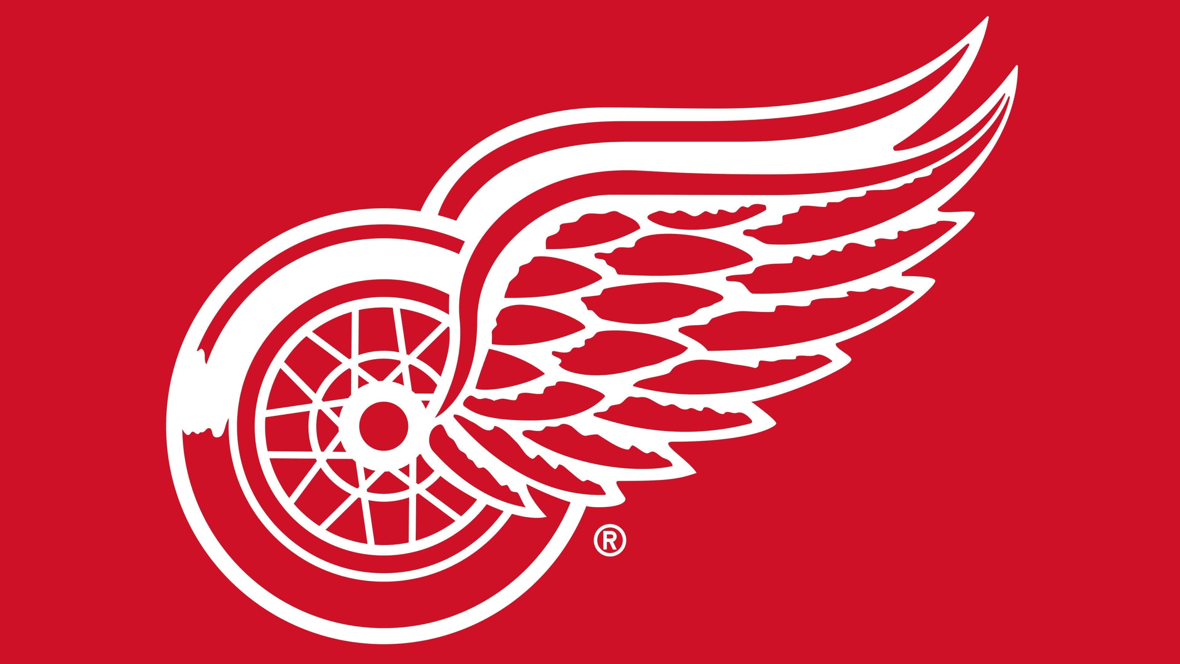
The identity change brought the team an outstanding logo, the Detroit Red Wings, which is memorable, makes an indelible impression, pays tribute to history, and matches the inner state of the athletes. Thus, the emblem of the Detroit Red Wings is made in the form of a winged wheel. It has an allegorical meaning and emphasizes the excellent physical condition of the players.
Detroit Red Wings: Brand overview
| Founded: | 1926 |
| Founder: | Ilitch Holdings |
| Headquarters: | Detroit, Michigan, U.S. |
| Website: | nhl.com |
Is there a city in the USA where hockey is more popular than in Detroit? Definitely not. Detroit ranks first thanks to the “Detroit Red Wings,” the most famous NHL franchise. The city, known as Hockeytown, is exceptionally proud of its long and glorious hockey history. The team entered the National Hockey League in 1926 under the name “Detroit Cougars.” In 1930, the “Cougars” were renamed “Falcons.” In the 1926-27 season, the Detroit club played its first season in Windsor, Ontario, Canada. Why in Canada? Most players of the new NHL franchise played for the Canadian club Victoria Cougars. Moreover, the team retained the name “Cougars” out of respect.
The “Victoria Cougars” became another victim of the premature disbanding of the Western Canada Hockey League. In 1925, the “Cougars” became the last team not in the NHL to win the Stanley Cup, defeating the “Montreal Canadiens,” the previous Stanley Cup champions. Thus, the “Victoria Cougars” is the only non-NHL team to have won the Cup since the founding of the world’s main hockey league.
After moving to Detroit, the “Cougars” kept their name and jersey (a white sweater with a wide red cross strip) now adorned with a gothic “D” representing the city of Detroit.
In 1930, the name of the unsuccessful team was changed to “Detroit Falcons.” The franchise bore this name for only two years, until 1932. The “falcons” shirts had many thin red on white stripes. Additionally, they printed the club’s new name and the Detroit Falcons logo on the chest. However, the new name did not change the team’s fate.
In 1932, the franchise was bought by millionaire James E. Norris (a Canadian grain merchant), who decided to rename his team to the familiar “Red Wings.” He also designed the team’s current logo: wings emerging from a wheel.
The iconic winged wheel logo was inspired by the Montreal Amateur Athletic Association Winged Wheelers team, for which James E. Norris played in his youth. Remembering his Montreal childhood, James E. Norris could not overlook that the winged wheel would become the primary logo for a franchise from Motor City. In the emblem of the Montreal team were wings and a wheel, adopted by the “Detroit Red Wings.” That’s why the bicycle wheel in the emblem of the Montreal Amateur Athletic Association turned out to be a running wheel in Detroit. Since then, the winged wheel has been a key symbol in the Detroit Red Wings logo. The wings do not stick up like horns but flutter in the wind, emphasizing the speed qualities of internal combustion engines, far superior to human muscle power. Since then, the Detroit Red Wings emblem has hardly changed. The Montreal Amateur Athletic Association “Winged Wheelers” were the first to win the Stanley Cup (1893). Naming his club “Detroit Red Wings,” James Norris paid tribute to the club that won the first Stanley Cup. Coincidence or not, but the new name and logo marked a turn in the team’s history. In their first season, the “Detroit Red Wings” made the playoffs. In total, the team has won 11 Stanley Cups.
Octopus Al – the mascot of the “Detroit Red Wings.” Al is the only NHL mascot without a costume.
Meaning and History
![]()
The Detroit Red Wings are one of the NHL’s most beloved teams. Over its 90-year history, the team has achieved colossal success. The Detroit Red Wings hockey team started as the Detroit Cougars went through the Detroit Falcons era, and then got its current name. All of this, of course, was reflected in the emblem. After each rebranding, it received a new visual embodiment. The franchise’s arsenal includes five individual graphic symbols, among which only one is different. The other four pairs are modifications of basic symbols. It all started with the Old English letter “D.”
What is Detroit Red Wings?
The “Detroit Red Wings” are a professional hockey team playing in the NHL’s Eastern Conference in the Atlantic Division. It is one of the most successful and popular clubs of our time. The franchise was formed in 1926 as the “Detroit Cougars,” then it became the “Detroit Falcons.” The team received its current name in 1932.
1926
![]()
The first emblem of the “Detroit Red Wings” consisted of an Old English red letter D.
1927 – 1930
![]()
However, the second emblem of the “Detroit Red Wings” club, like all logos of that time, was expressive, minimalist, and somewhat reminiscent of a banner. It was a red shield in the shape of a rectangle with a white outline and an Old English white letter “D,” representing the city of Detroit.
1931 – 1932
![]()
In the 1931-1932 season, the club’s name was changed to “Detroit Falcons,” and the logo was changed to change the club’s misfortune. It was a simple emblem with the word “Detroit” arranged in an arch above “Falcons.” Both words were written in yellow letters with a thin red outline.
1932 – 1933
![]()
In 1932, the “Detroit Red Wings” got a new owner – James Norris. Getting a sports franchise, he immediately changed its style. The new logo was created from scratch and had nothing in common with the old word marks. It resembled a dream catcher, but in reality, it was a car wheel because, at that time, Detroit’s auto industry was booming. Designers wanted to convey the city’s most characteristic feature in the emblem. And to illustrate the hockey team’s name, they added wings to the wheel. One of them was in front, so the white feathers outlined in red lines were visible. The second wing was behind, so the artists did not detail it. The entire emblem was white and red; the second color was mainly used for outlines.
1933 – 1948
![]()
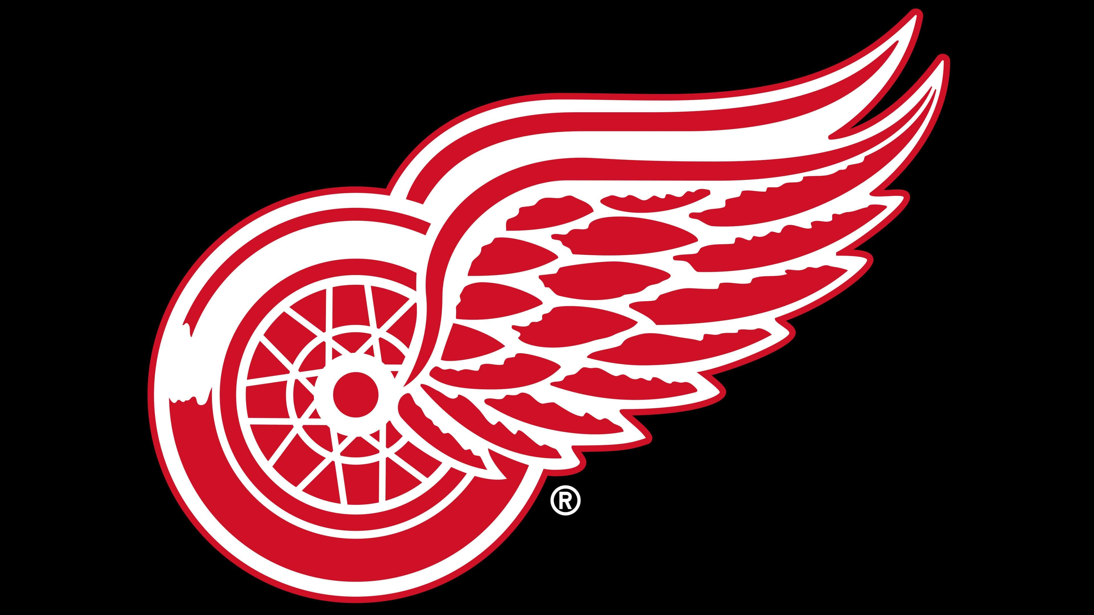
Acquiring the franchise in 1932, James Norris completely changed its corporate style. Thus, the club got a new Detroit Red Wings emblem, which was a symbolic red car wheel with two red-and-white wings on the right. At the time, Detroit was the automobile capital of America. The club owner wanted to draw attention to Detroit’s industrial development in the mid-20th century. Since then, the Detroit Red Wings emblem has undergone no significant changes: minor modifications affected small details, the sizes of the wheel, and wings.
1949 – today
![]()
Revitalizing the game in Motor City, club owner James Norris chose a red-winged wheel as the emblem. This version has a dual meaning. First, it emphasizes the city’s importance as the center of the automotive industry. Second, it conveys the team’s close connection with Detroit. As a result, the new symbol has stood the test of time and is still in use.
The club’s logo is concise and contains nothing superfluous. It resembles a car wheel, the center of which is a set of wings, like Pegasus. Although only one wing is visible, the high double line at the top indicates that they are paired. The lower part of the wheel and feathers are painted red; everything else is white. Today, the winged wheel is extremely famous and recognizable in hockey.
Detroit Red Wings: Interesting Facts
The Detroit Red Wings are a famous hockey team and one of the first six teams in the NHL. They have a lot of history, great players, and have done much for hockey.
- How They Started: The team began in 1926, first called the Detroit Cougars, then the Falcons in 1930, and finally, they became the Red Wings in 1932. Their name comes from a cycling club because the guy who bought the team liked the cycling club’s name.
- Championships: The Red Wings have won the Stanley Cup 11 times, which is a lot. Only two other teams have won it more times.
- Famous Players: They had a group called the Production Line with Sid Abel, Gordie Howe, and Ted Lindsay, who were good in the late 1940s and 1950s. The name was a nod to Detroit’s car industry.
- Gordie Howe: Also known as “Mr. Hockey,” Gordie Howe played with the Red Wings for 25 seasons and was amazing, setting records for most games and points.
- The Russian Five: In the 1990s, the team had five Russian players who were key in winning the 1997 Stanley Cup. They were Sergei Fedorov, Igor Larionov, Vyacheslav Kozlov, Vladimir Konstantinov, and Viacheslav Fetisov.
- Joe Louis Arena: Before 2017, the Red Wings played at Joe Louis Arena, named after the boxer Joe Louis. It saw many of the team’s big moments.
- Octopus Tradition: A strange but fun tradition started in 1952, which involved throwing an octopus on the ice during playoffs. The eight tentacles represent the wins needed for the Cup.
- Steve Yzerman: The Red Wings picked him up in 1983. He played all 22 seasons with them, led the team as captain for 19 seasons, and won three Stanley Cups.
- The Dead Wings Era: There was a tough time from the late ’60s to early ’80s when the team didn’t do well, known as the “Dead Wings” era. But they came back stronger in the late 1980s and 1990s.
- Playoff Streak: The Red Wings made the playoffs for 25 straight seasons from 1991 to 2016, showing how consistently good they were.
These points show why the Detroit Red Wings are such a respected team in the NHL with a long history, famous players, and fun traditions.
Font and Colors
The history of the logo’s transformation includes five versions, separated by periods and design. The earliest versions are based on the Old English letter “D.” Initially, the letter was used separately, so the emblem had no clear borders. Then, the developers added a two-line chevron to it.
The next logo is transitional. The club’s name was placed in two lines: the top was arched, and the bottom was straight horizontal. The current version appeared thanks to the franchise owner, James Norris, who tried to link the team with the automotive industry theme through symbolism. In his youth, he was associated with the MAAA Winged Wheelers team, which wore a winged wheel on their uniform.
The club’s name is written in a custom font with elongated ends of “R” and ornate elements on “D” and “W.” This design was introduced in 1948 and has not changed since.
The color palette is stable: the club has been loyal to the red-and-white palette from the beginning. The emblem contains only one shade of red – Pantone 186 C, HEX: #C8102E, complemented by a white background.
Detroit Red Wings color codes
| Red | Hex color: | #c8102e |
|---|---|---|
| RGB: | 200 16 46 | |
| CMYK: | 2 100 85 6 | |
| Pantone: | PMS 186 C |
FAQ
What does the “Detroit Red Wings” emblem represent?
Their emblem features a wheel with spokes and wings, each with three vertical rows of clearly drawn feathers. Though this emblem is minimalist, it’s recognized as iconic in the world of branding.
Why is “Detroit” called the “Red Wings”?
The Detroit hockey team got its name thanks to the emblem, which depicts two red wings connected to a wheel of the same color. The franchise chose this symbol in honor of the first sports club to win the Stanley Cup – the “Winged Wheelers” of the Montreal Amateur Athletic Association.
Why are the letters Detroit Red Wings positioned on the right side?
With the league’s transition to RBK shirts, the logo was moved slightly higher. The “Detroit Red Wings” found it inappropriate to place another round element (“C”) next to the wheel, so they moved it not to the left but to the right.
What shade of red is used by the “Detroit Red Wings”?
The red color in this hockey club’s logo is executed in a shade called Lava. In the Hex color system, it is encoded as #CF0820 and in RGB as 207, 8, 32.