![]() Houston Rockets Logo PNG
Houston Rockets Logo PNG
The “Houston Rockets” logo features an image of a rocket. It is present everywhere: in the vertical lines, in the stem of the letter R, in the ring, and even in the ball, which looks like a globe with an orbit. At the same time, the style of the emblem is sporty. It conveys high-speed reaction, quick movements, and determination, as no obstacles are too great for the team.
Houston Rockets: Brand overview
| Founded: | 1967 |
| Founder: | Tilman Fertitta |
| Headquarters: | Houston, Texas, U.S. |
| Website: | nba.com |
What name could suit a team from Houston more than the Rockets? It fits! Nonetheless, the “Rockets” were not originally from Houston.
For the overwhelming majority of club owners, the clubs they own are not just a fortunate (or otherwise) investment but a business to which they dedicate a significant portion of their time and effort. However, few modern owners can compare their passion for sports with Robert Breitbard, who is considered the godfather of professional sports in San Diego, California. Being a professional athlete and coach, Robert Breitbard initiated the creation of the Breitbard Sports Fund, intended to commemorate significant sports achievements of high school students, college students, and professional athletes in San Diego. In 1966, Robert Breitbard was involved in constructing a sports arena in San Diego, which a year later became home to the “San Diego Rockets.”
The franchise was established in 1967 in San Diego, California. After a competition for the team name, the club was named “Rockets” as a tribute to the military-industrial complex enterprises located in San Diego, for instance, General Dynamics, which was involved in developing the “Atlas” missile and rocket carrier. The “rocket” theme was also present in the attractive, sunny team logo. However, despite this, the color palette of the “San Diego Rockets” logo included orange and blue, while the colors of their jerseys were green and yellow.
The new franchise only lasted in San Diego for three years, as poor results, bad attendance, and local fans and media’s lack of attention forced Robert Breitbard to sell the team for $5.6 million to the Texas Sports Investments company, which decided to move the club to Houston. Upon moving to Houston, the franchise did not change its name, as Houston is home to NASA’s leading scientific and space training center. The club’s management and fans thought the name “Houston Rockets” seemed perfect for a team based in Space City. Although the team name was not changed, the green color in the club’s color palette was replaced with red. The new “Houston Rockets” logo, introduced in 1972, featured a slightly silly cartoon basketball player with a jetpack, having nothing to do with Houston or the Rockets. However, just a year later, the team removed all funny elements from their identity: the “Houston Rockets” logo turned into a stamp, and the uniform took on a more monotonous look.
Meaning and History
![]()
The logos of the basketball club “Houston Rockets” reflect its name, which was chosen in the late 1960s when the franchise was owned by San Diego. The nickname perfectly fits into the legacy of this city. First, it reminded of the ICBM ballistic missile developed by the local company General Dynamics. Secondly, San Diego has always been considered a “city in motion,” associated with speed. Therefore, designers depicted a rocket on almost every emblem, except for the 1971-1972 and 1972-1995 versions.
What is Houston Rockets?
Houston Rockets is a club of the Southwest Division (NBA) that joined the league in 1967. At that time, they were known as the “San Diego Rockets.” The renaming occurred in 1971 when the new owner of the franchise, Texas Sports Investments, moved it to Houston. The main part of the name, “Rockets,” was not changed, as this city is closely related to the space industry.
1967 – 1971
![]()
The team “San Diego Rockets,” which preceded the “Houston Rockets,” had a stylish logo with a blue rocket against a brown basketball. Two curved rectangles surrounded the image in green with the inscriptions “San Diego” and “ROCKETS” in yellow. On the rocket, the league’s name was written in white letters: “N.B.A..”
1971 – 1972
![]()
In 1971, Robert Breitbard sold the team to new owners, who forced it to move to Houston. The nickname did not change, but the leaders decided to redo the logo completely. That same year, a version was presented featuring a cartoon basketball player who had risen into the air on a jetpack and was spinning a yellow ball with the inscription “NBA” on his finger. A fiery stream poured from the backpack. To the right was the name of the club – “Houston Rockets.”
1972 – 1995
![]()
Keeping the yellow-red color scheme, designers developed a simpler emblem known as “mustard and ketchup.” This time, the central element was a golden basketball with a black inscription “ROCKETS” in the center. Two red arcs surrounded it with the white word “HOUSTON.”
1995 – 2003
![]()
In 1995, the team held a contest among fans: everyone could send their sketch of a new logo. The “Houston Rockets” were attracted by the idea of artist Thomas Nash, who depicted a ball-planet with a flying rocket around it. The drawing was refined by designer Chris Hill, after which the club presented the final version of the emblem. Thomas Nash was forced to sue for non-payment of prize money.
The improved version contained a caricature element: a face at the top of the rocket. Its tip resembled a nose. It was complemented by furrowed brows, round eyes, and a mouth with shark teeth. The team used this image to appeal to the NBA league, which promoted a cartoonish style.
2003 – 2019
![]()
In the 2003-2004 season, the club introduced another logo – this time created by the branding agency Alfafa Studio and designer Eiko Ishioka. The authors came up with a concept depicting a large letter “R” in the form of a soaring rocket. The red ring around the letter represents the central circle on the basketball court. The letter “R” divides the words “HOUSTON” and “ROCKETS,” executed in an unusual font.
2019 – today
![]()
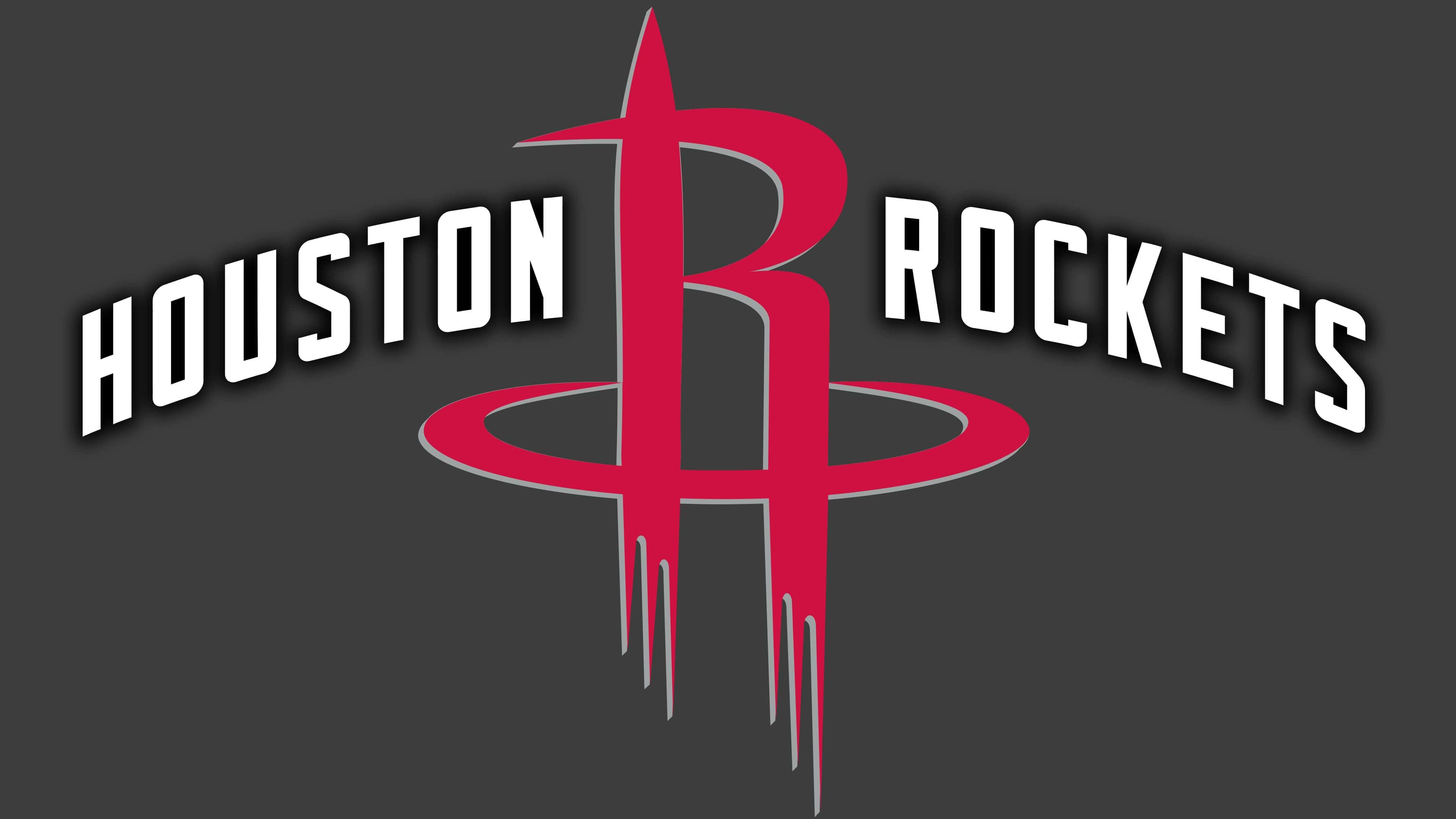
The latest changes in the “Houston Rockets” logo occurred in 2019. The logo maintains the cosmic identity of the “Houston Rockets.” The basketball represents the spherical part of a gray-black planet with an orbital ring, on which the white font logo “Houston Rockets” surrounds the basketball. In front of the planet, a red rocket is depicted in the shape of the letter “R,” which continues to be the team’s primary logo. The unusual combination of graphite-gray, black, and bright red is expected to bring success to the team.
Houston Rockets: Interesting Facts
- Early Days: The Rockets started in 1967 and moved to Houston in 1971, where they became a big deal thanks to the city’s connection to space.
- Winning Big: They won their first big championship in 1994 and did it again in 1995, thanks to a great player named Hakeem Olajuwon.
- Hakeem Olajuwon: Known as “The Dream,” Olajuwon helped the Rockets win two championships and was famous for being good at defense.
- Nickname: After some amazing wins in 1994, people started calling Houston “Clutch City” because the team was good under pressure.
- Yao Ming: Yao Ming came from China and joined the Rockets in 2002. He was super tall and made lots of people in China start watching basketball.
- Home Court: The Rockets have played at the Toyota Center in Houston since 2003, a cool place for fans.
- James Harden: James Harden joined the Rockets in 2012 and became one of the best scorers. He was the MVP in 2018.
- Playing Style: The Rockets like to shoot a lot of three-pointers and layups, which has changed how basketball is played.
- Three-Pointers: The Rockets have broken records for shooting three-pointers, showing they love long shots.
- Helping Out: The Rockets help their community with education and sports through the Clutch City Foundation.
- Honoring Players: To honor them, they’ve retired the jerseys of some of their best players, like Olajuwon and Yao Ming.
- Dynamic Duo: In 2019, James Harden and Russell Westbrook, two great players, teamed up on the Rockets.
The Rockets have been important in basketball thanks to their great players, new ways of playing and helping their community.
Font and Colors
All the logos of the “Houston Rockets” share a space theme. At different times, artists individually played with this concept until the final version was accepted with the letter “R” instead of a soaring rocket and a planetary ball. The design looks unique: the authors managed to create a minimalist abstraction, focusing on the name of the basketball team.

The original font was developed based on the stylized letter “R,” which became a symbol of the rocket. But the font with thin, sharp lines and rounded corners was only used from 2003 to 2019 – after the redesign, an emblem with a simplified inscription appeared. However, rounded corners were partially preserved.
The color palette has changed several times. Initially, red and gold predominated (from 1971 to 1995). Then, gold was replaced by white and blue (1995-2003). Then, the designers used only red (2003-2019). In 2019, it was complemented by a gray-black gradient, leaving the red “R.”
Houston Rockets color codes
| Red | Hex color: | #ce1141 |
|---|---|---|
| RGB: | 206 17 65 | |
| CMYK: | 100 65 15 | |
| Pantone: | PMS 200 C |
| Silver | Hex color: | #c4ced4 |
|---|---|---|
| RGB: | 196 206 211 | |
| CMYK: | 5 0 0 20 | |
| Pantone: | PMS 877 C |
| Black | Hex color: | #000000 |
|---|---|---|
| RGB: | 6 25 34 | |
| CMYK: | 30 0 0 100 | |
| Pantone: | PMS Black C |
FAQ
What does the “Houston Rockets” logo mean?
The large red letter R in the logo represents the word Rockets, with which it begins and illustrates it, resembling a soaring rocket. Additionally, R is depicted against a basketball styled as a planet. The surrounding strip with the inscription HOUSTON ROCKETS resembles an orbital ring.
When did the “Houston Rockets” team change the logo?
The Houston Rockets team changed the logo in 2019 when it needed a reboot of the existing style. However, it did not deviate from the old concept and retained its main distinctive element – the red letter “R,” stylized as a rocket.
In which city are the Houston Rockets located?
The Houston Rockets are located in the most populous city of Texas and named after it. Its home stadium is the Toyota Center.
What font is used in the “Houston Rockets” logo?
For the inscription “HOUSTON ROCKETS,” which appears on a ring-shaped ribbon, the designers used a special set of glyphs. It’s a modified bold serif font.