![]() Los Angeles Chargers Logo PNG
Los Angeles Chargers Logo PNG
The information-rich and visually succinct logo of the Los Angeles Chargers represents American football from Los Angeles. Its symbol is a victory motivator, embodying speed, agility, and energy.
Los Angeles Chargers: Brand overview
| Founded: | August 14, 1959 |
| Founder: | Dean Spanos |
| Headquarters: | Costa Mesa, California, U.S. |
| Website: | chargers.com |
The Los Angeles Chargers are a professional American football team based in Los Angeles, California. The team plays in the National Football League (NFL) as a club of the Western Division of the American Football Conference (AFC).
The team was founded on August 14, 1959, and began playing on September 10, 1960, as a charter member of the American Football League (AFL). The club spent its first season in Los Angeles, then moved to San Diego in 1961, where all athletes and intellectual property were renamed the San Diego Chargers. The team was based there until 2016. The Chargers’ return to Los Angeles was announced for the 2017 season, and now their home stadium is located in this city.
The Chargers’ original owner was hotel business heir Barron Hilton, son of Hilton Hotels founder Conrad Hilton. Lamar Hunt, who was involved in organizing the AFL, said he asked Gene Mako to propose creating a team in Los Angeles, and he recommended Hilton. Hunt said he visited Hilton for less than an hour, and Hilton immediately agreed to found the team.
In 1966, the first owner sold the Chargers to a group of 21 people for $10 million. Leading investors were Gene Klein and Sam Schulman. Alex Spanos acquired a controlling stake (60%) in the San Diego Chargers from Klein on August 1, 1984. Over the next ten years, he bought out the shares of several minor co-owners, bringing his control of the team to 97%. George Pernicano, a restaurateur from San Diego, owns the remaining 3%. Since 1993, Dean Spanos has been managing the franchise’s daily operations.
Barron Hilton held a contest to find a name for his team. The prize was a trip to Mexico. A man from Hollywood named Gerald Courtney suggested the name “Chargers” and won. Conrad Hilton said, “I liked the name because they shouted ‘Charge’ at the stadium during games.” Hunt said he believed Hilton chose the team’s name from the first batch of letters as an advertisement for his new Carte Blanche account servicing business.
Meaning and History
![]()
Horseheads, shields, football helmets, and lightning bolts are the most famous elements of the Los Angeles Chargers logos. The team has always paid attention to its identity and often changed it because it had to move, including a new city in the name, and experiment with its image. The only symbol that has always been present on each emblem is the lightning bolt. Artists depicted it differently: on a heraldic shield, on a helmet, or in the form of the letter “L.” But the most famous version is a zigzag strip of an arc shape.
What are Los Angeles Chargers?
The Los Angeles Chargers are one of the four teams of the Western AFC. It was founded in 1959 and debuted in the American Football League. Its headquarters are in Costa Mesa, California, and its home stadium is in Inglewood, the same state.
1960
![]()
The original Chargers logo has a reference to heraldry – to the so-called carol. The Los Angeles Chargers logo is in the form of a circle with an element inside. At the center of the logo is a shield with a dark blue horse’s head. On both sides of the horse’s head are blue “LA” and white “CHARGERS” letters. The word “CHARGERS” is white, like lightning. This is done to make it more noticeable. A wide blue band with the team’s gold nickname frames the logo.
1961 – 1973
![]()
In 1961, the team moved to San Diego, which automatically required a change in the logo, as “Los Angeles” was mentioned twice in it. Designers changed the emblem’s design and removed the blue circle with the inscription. The word “Los Angeles” was also removed from the shield. Only the shield (which was enlarged), the horse’s head, the lightning bolt, and the word “CHARGERS” under it remained. The color was changed: dark blue became powder blue.
1974 – 1987
![]()
During this period, the team’s logo deviated from the previous standard: The San Diego Chargers logo consisted of a side view of a helmet. The design is minimalist, without small details. The main element is blue, and its components are yellow. A gold lightning bolt with white and light blue trim and a gold face mask is depicted on the helmet. The team owner resolutely did not want to give up the lightning bolt image: he considered it a very important element, motivating the players to victory. The helmet contour and metal rods are black.
1988 – 2001
![]()
The new helmet logo was introduced in 1988. The idea remained the same as in the previous emblem. The only changes were a darker color scheme, a more modern face mask, and the positioning of the lightning bolt, which was moved closer to the back of the head. This was done so that the elements of the face mask did not obscure the lightning bolt.
The look of the dark blue helmet in 3/4 was more realistic due to the small details. The colors and shapes of the lightning bolt have not changed – it looks like a zigzag with a two-tone contour.
2002 – 2006
![]()
The “San Diego Chargers” logo was radically changed due to the frequent relocations of the team. The Chargers moved from a helmet logo to an arched bolt logo. The bolt is white with a dark blue and gold outline. This key element looked like the 1974 image when it was on the helmet.
2007 – 2016
![]()
The use of the new logo marked the next decade. It was an adaptation of the previous Chargers logo. It featured an arched gold lightning bolt with powder blue and dark blue outlines. Designers deliberately used yellow: it referred to the team’s amazing speed, agility, and energy.
2017
![]()
A new logo appeared in 2017. It attempted to replace the main logo due to the club’s move to Los Angeles. However, fans, the media, and the franchise competitor did not like this version. They criticized it for its resemblance to the “Los Angeles Dodgers” logo. As a result – this emblem was used for only two days.
This version featured “LA” letters with a lightning bolt coming out of the inscription. The letters intersect each other and resemble lightning: the zigzag lower part of the letter “L” is stretched forward and upward. The background is dark blue, like a stormy sky; the central elements are white, like a bright flash in the dark.
2017 – 2020
![]()
The current logo, like the previous one, has a curved lightning bolt. Its first version was created in 2002, with a white color surrounded by two blue and yellow lines. Since then, the design has changed several times. The transformations were not very noticeable because the developers only paid attention to the color scheme, and the original arched shape remained unchanged.
The lightning bolt is semi-circular – possibly because it first appeared on the emblem with a blue helmet and was curved so as not to go beyond its boundaries.
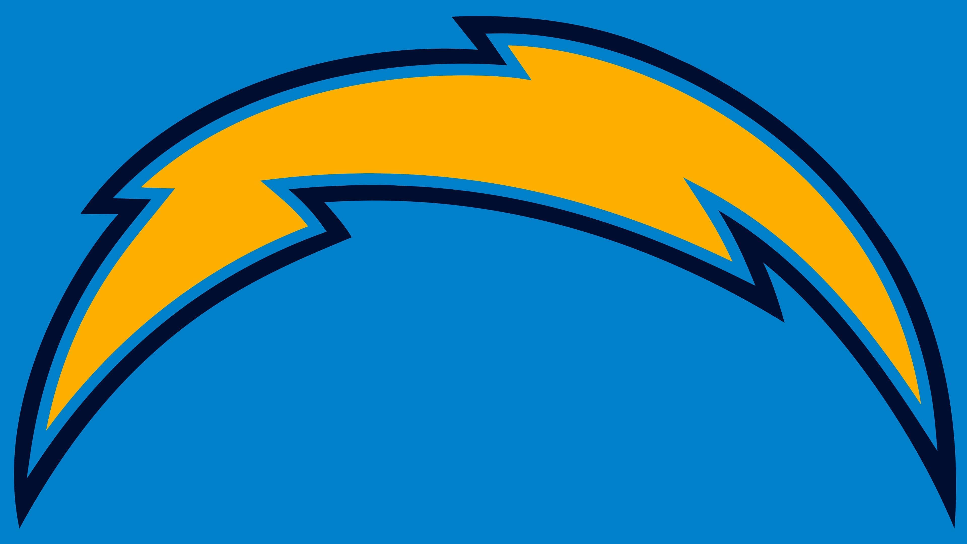
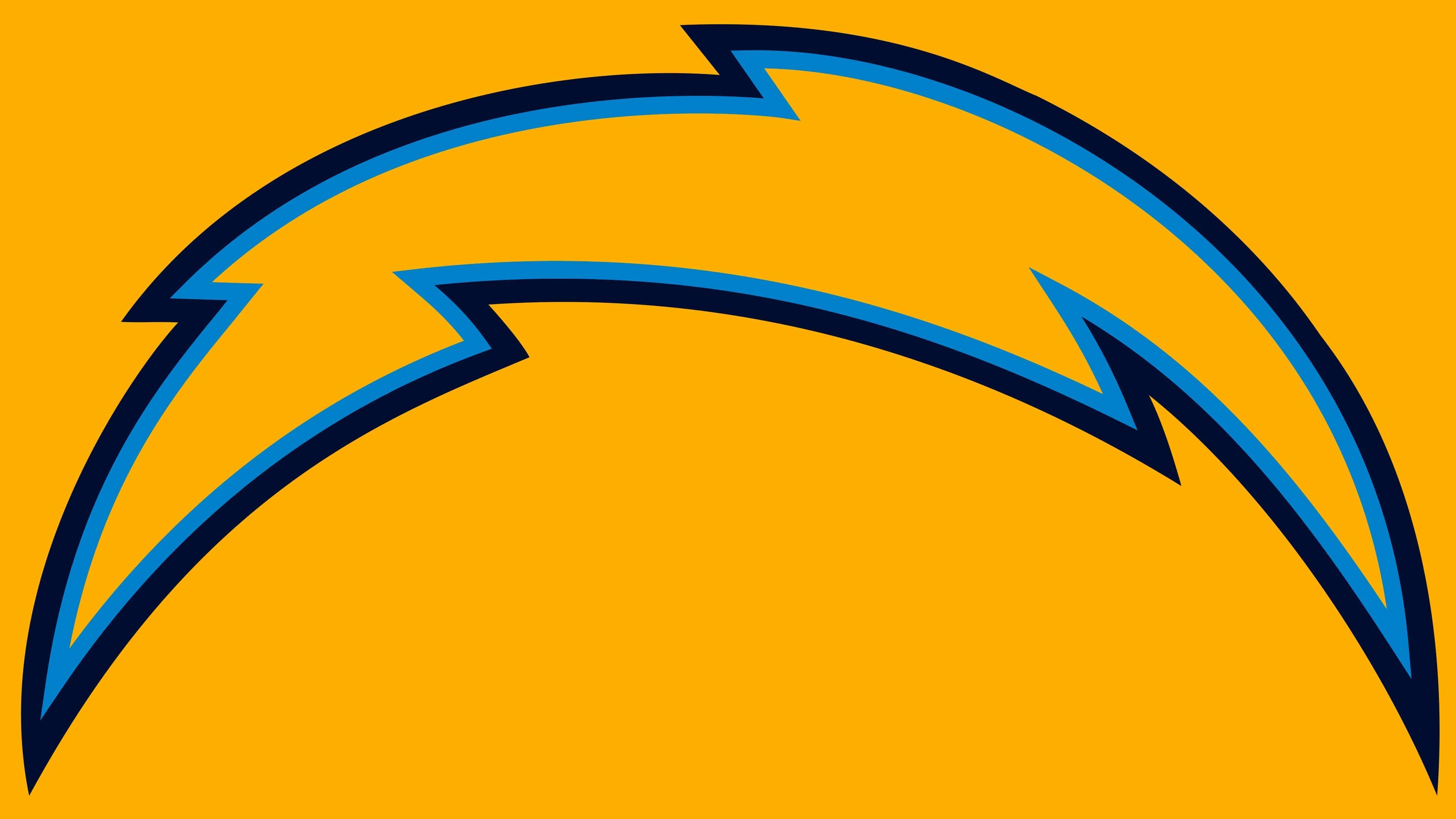
2020 – today
![]()
The modern emblem of the Los Angeles Chargers dates back to 2020 and looks quite different: a yellow zigzag strip with a blue border. This happened in 1974 when the team was still called the San Diego Chargers. The emblem lost one of the external contours. The emblem’s border became thicker.
Los Angeles Chargers: Interesting Facts
The Los Angeles Chargers are an American football team with a long story that includes moving cities and lots of exciting football.
- Starting and Moving: The Chargers started in Los Angeles in 1960 but moved to San Diego after just one year. They stayed there for 56 years before returning to Los Angeles in 2017.
- Early Champions: In 1963, before the big leagues merged, the Chargers won a championship by beating the Boston Patriots. That’s a big deal in their history.
- The Lightning Bolt: They have a cool lightning bolt logo that everyone knows. It’s changed slightly over time but always shows the team’s speed and energy.
- Air Coryell: In the late 1970s and early 1980s, Coach Don Coryell and quarterback Dan Fouts made the Chargers famous for throwing the ball and changing the game.
- Famous Players: Some Chargers are in the Pro Football Hall of Fame, like Lance Alworth, Dan Fouts, Junior Seau, and LaDainian Tomlinson, because they were amazing players.
- Junior Seau: He was a passionate and important player for the Chargers. People loved him a lot, and they were very sad when he passed away in 2012.
- LaDainian Tomlinson’s Big Year: In 2006, he scored 31 touchdowns in one season, which no one has beaten yet. Because he was so good, he was the MVP that year.
- Back to Los Angeles: The Chargers moved back to Los Angeles in 2017, marking a new start. They first played in a smaller stadium and then moved to the big, new SoFi Stadium, which they share with the Los Angeles Rams.
- Cool Uniforms: They wear powder blue uniforms that people like. The color and the lightning bolt make them stand out.
- Philip Rivers: He was the Chargers’ quarterback from 2004 to 2019 and is one of the best they’ve ever had. He’s known for being tough and competitive.
The Los Angeles Chargers have had a big impact on football with their cool style, great players, and being part of the NFL for a long time.
Font and Colors
For the football club, lightning is a sign of energy, speed, and decisiveness. It has fundamentally used this favorite symbol since 1960, not abandoning it even during major image changes. This is especially noticeable in the latest emblems, which feature nothing but lightning.
To compensate for the lack of other elements, designers depicted it in an unusual style. First, it is not narrow but wide, consisting of two zigzag lines connected at the ends. Second, the artists gave it an unusual arc shape.
Inscriptions were only in the logos of the first teams, but now all attention is focused on the lightning. Its color scheme was carefully worked out: from 2017 to 2020, the palette included white, blue, light blue, and yellow; after 2020, yellow became the primary color, and blue – was secondary, and light blue was discontinued. White, as before, serves as a neutral background for the bright graphic sign. The team has always used these colors in different combinations to make their logos recognizable.
Los Angeles Chargers color codes
| Navy Blue | Hex color: | #002244 |
|---|---|---|
| RGB: | 0 21 50 | |
| CMYK: | 100 65 0 60 | |
| Pantone: | PMS 289 C |
| Powder Blue | Hex color: | #0073cf |
|---|---|---|
| RGB: | 0 128 197 | |
| CMYK: | 90 40 0 0 | |
| Pantone: | PMS 285 C |
| Gold | Hex color: | #ffb612 |
|---|---|---|
| RGB: | 238 173 30 | |
| CMYK: | 0 25 100 0 | |
| Pantone: | PMS 1235 C |
FAQ
Why is the team called “Los Angeles Chargers”?
Barron Hilton, the first franchise owner, organized a naming contest for team fans and promised a trip to Mexico as a prize for the winning name. The version presented by Gerald Courtney won. Barron Hilton liked the word Chargers so much that he didn’t even open the rest of the letters. There are rumors that the team owner liked the name of his Carte Blanche card.
Why did the “Chargers” change their logo?
The “Los Angeles Chargers” had a good reason to update their logo – moving to the SoFi Stadium football field. A new era began in the team’s history, as it finally had a home stadium for playing in the National Football League.
What should the “Chargers” logo look like?
The football club’s logo should look like a wide and short arc-shaped lightning bolt. The inner part of the drawing is yellow, and a light blue line is drawn along the outer side.
Has the “Los Angeles Chargers” logo changed?
Yes, the “Los Angeles Chargers” changed their logo in 2020 in honor of moving to a new stadium. This is the first update of the team’s main symbol since 2017.