The symbolism of the emblem of another basketball club from Los Angeles, founded in 1970 as Buffalo Braves, lies in the aspiration to reflect its history. The new logo and name, Los Angeles Clippers, is a tribute to the hometown, the true roots, and the team’s history.
Los Angeles Clippers: Brand overview
Despite the lack of significant achievements, New York still holds the title of basketball Mecca. New York’s reputation as a forge of basketball talents extends far beyond the metropolis. The western part of the state has become the cradle for three current NBA clubs. The Los Angeles Clippers team is one of these legends.
Initially, the team was based in the city of Buffalo. It was called Buffalo Braves (Braves is a term used in the past to refer to Native American warriors). This explains the feather on the emblem. In Buffalo, as in all other parts of North America, Indians once lived. But most likely, the name was chosen because it sounded good in combination with the city’s name.
During its eight years of existence, the “Braves” reached the NBA playoffs three times. Each time, they gave way to future champions. After Bob McAdoo moved to the “Knicks,” interest in the team declined. Soon, the club was sold to the well-known businessman and politician John Y. Brown Jr. He made an unprecedented deal to swap the club with Irv Levin, the owner of the “Celtics.”
Levin dreamed of moving to California, preferably along with his basketball club. But moving the “Celtics” to any city other than Boston automatically meant a “long and painful death” at the hands of local fans.
Having received a nearly dead team, Levin immediately moved it to California. The club’s headquarters remained in San Diego, which had lost its team after the “Rockets” moved in 1971.
In a city where the most seasoned brave men in the form of Marines and trainers of local zoo whales stopped, there was no place for a team named Braves. The club’s management suggested giving the team’s name more local color. Therefore, the new name, San Diego Clippers, was soon approved. The team, retaining the old colors, was called the “Clippers,” after the city’s history as an important port in the Pacific Ocean. By the way, the Clipper Star of India is still moored there as a floating museum. Three cleavers (a distinctive part of the clipper’s rigging) became the emblem of the new team.
A clipper is a fast-moving sailing vessel or ship with sharp, water-cutting hull outlines. San Diego was famous for such ships.
In 1981, the team was acquired by the infamous Donald Sterling. By that time, less than 5,000 people attended matches of the non-competitive team. Therefore, the team decided to move.
In 1984, Sterling managed to get NBA approval to move to Los Angeles, where the team had long been in the shadow of another local club. As for the club’s name, “Sterling,” was decided to leave it unchanged. This decision is quite understandable: the term clipper can mean hair clippers and lawn shears. And this is the only job that, according to Sterling, “these black guys” do well. The Los Angeles Clippers team does not have a mascot.
Meaning and History
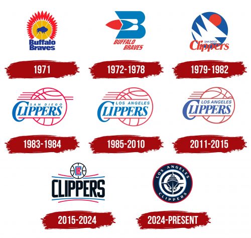
The Los Angeles Clippers team previously had several names and logos. This is partly due to relocations: first, the franchise was in Buffalo, then moved to San Diego, and in 1984 moved to Los Angeles. But the change of emblems is explained not only by the move and the choice of a new nickname (until 1978, the club was called Braves) – the redesign is aimed at modernizing the style to improve the team’s image.
What is Los Angeles Clippers?
Los Angeles Clippers is an NBA baseball club that has changed three cities in its history. Initially, it was based in Buffalo and known as the “Braves.” Then, it was transferred to San Diego and named Clippers. In 1984, the sports franchise was moved to Los Angeles, retaining its current name.
1971
The debut logo of the Buffalo Braves contains only four elements. The first is the silhouette of a blue bison looking to the right. The second – an orange basketball. The third – red feathers in the shape of a Native American headdress. The fourth – is the inscription “Buffalo Braves,” executed in a standard sans-serif font.
1972 – 1978
From 1972 until the move to San Diego, the team used a complex multi-component emblem with a stylized letter “B.” Designers gave the “B” an original shape and decorated it in the center with a red-and-blue feather. The inscription “BUFFALO BRAVES” was made in italics and red so as not to get lost against the background of the central letter.
1979 – 1982
In 1978, the club moved to San Diego and received the nickname Clippers in honor of the ships sailing in San Diego Bay. Then it got an abstract logo with three white triangular sails and a red sun inside a blue circle. The team’s name, as before, is written below: “SAN DIEGO” in small blue letters and “Clippers” in large orange ones.
1983 – 1984
In 1983, designers changed the font, color, and size of the inscription, making it the central element of the logo. They placed the light blue words “SAN DIEGO CLIPPERS” between two pink horizontal lines and complemented them with many stripes in the shape of a basketball.
1985 – 2010
Having moved to another city, the club updated its logo. It replaced the inscription “SAN DIEGO” with “LOS ANGELES” and removed the two horizontal lines to the ball’s right. The bright red-pink color became more subdued.
2011 – 2015
In 2011, another minor redesign occurred. This time, designers turned the ball in the opposite direction, changing the direction of the seams. They also chose a darker shade of blue for the team’s name.
2015 – 2024
In the current logo, the ball is reduced and shifted upwards. Below it is the word “CLIPPERS,” underlined above and below by two arc-shaped lines in raspberry and blue. They enclose the symbol of the ocean horizon as a reminder of the team’s true roots. Inside the ball is a monogram of the letters “CLA.”
2024 – today
In a bold move that reflects both ambition and the spirit of innovation, the Los Angeles Clippers have introduced a new “Global” logo. This design seeks to redefine how sports identities operate within the modern era. This redesign, while unconfirmed, is rumored to be the work of Brooklyn, NY-based Doubleday & Cartwright, known for their transformative approach to the Milwaukee Bucks identity. The Clippers’ new logo ambitiously integrates a nautical theme, featuring a collection of elements including a ship, a compass, the letter “C,” and the ever-present basketball symbol.
The choice of a nautical theme is a nod to the Clippers’ namesake and a bold step into a narrative-rich design language. The logo ingeniously combines its core elements, using the compass as a navigational tool and an integral part of the ship’s structure, shaping the hull and the mast while interacting with the “C” in the backdrop. This synthesis of elements into a single graphic speaks to a commendable execution level, showcasing an intricate balance between individual symbolism and collective harmony.
However, the design’s ambition encounters a perceptual hurdle. The prominence of the ship’s hull, paired with the detailed basketball seams, inadvertently shifts the ship’s representation towards a modern cruise liner rather than the intended vintage sailboat. This effect is magnified in smaller renditions of the logo, suggesting a challenge in maintaining the desired historical aesthetic at various scales.
Encircling the central nautical imagery is a layer of typography that brings a vintage charm to the logo, purportedly inspired by naval typography. Despite its aesthetic appeal and thematic relevance, this typographic ring starkly contrasts the contemporary, streamlined nature of the primary graphic elements. This divergence introduces a visual and conceptual tension within the logo, hinting at a complex interplay between traditional influences and modern design sensibilities.
The “Global” logo’s adaptability is showcased through its deconstruction into two separate logos, focusing on different element pairings. While this versatility allows for varied applications, it also raises questions about the cohesiveness of the logo’s components, particularly the compass element, which in isolation bears an unintended resemblance to a crosshair rather than a navigation tool.
The introduction of script marks represents a continuation of the Clippers’ historical visual language, offering a stylistic counterpoint to the primary nautical theme. While distinct in style, these scripts embody the team’s legacy and provide a bridge between past and present identities. The execution of these scripts, especially the stacked “LA,” is a testament to the design’s overall quality, even as it navigates the complexities of integrating diverse stylistic elements.
The emblem’s color scheme—red, white, and blue—reinforces this message, drawing on patriotic themes to evoke a sense of pride, energy, and competitiveness. This palette is not just American in spirit but universal in its appeal, reflecting the Clippers’ aspiration to inspire fans globally.
Los Angeles Clippers: Interesting Facts
The Los Angeles Clippers are a basketball team from Los Angeles, California. They play in the NBA’s Western Conference.
- Starting Out: The team began in 1970 as the Buffalo Braves. In 1978, they moved to San Diego and became the San Diego Clippers. In 1984, they moved again to Los Angeles, where they’ve been ever since.
- Getting Better: For a long time, the Clippers were not as successful as their city rivals, the Los Angeles Lakers. But since the early 2010s, they’ve been doing much better and have frequently made it to the playoffs.
- Lob City Era: From 2011 to 2017, the team experienced an exciting time. Players like Chris Paul, Blake Griffin, and DeAndre Jordan were famous for their amazing dunks, and people loved to watch them play.
- New Owner: In 2014, Steve Ballmer, who used to run Microsoft, bought the Clippers for $2 billion after some trouble with the previous owner. Ballmer’s purchase started a new chapter for the team.
- Arena Changes: The Clippers used to share the Staples Center with the Lakers and the LA Kings, a hockey team. In 2021, the Staples Center’s name was changed to Crypto.com Arena. The Clippers plan to move to their place, the Intuit Dome, in Inglewood by the 2024-25 season.
- Helping the Community: The Clippers work hard to help people in Southern California through the L.A. Clippers Foundation. They run programs and partnerships to make a positive difference in the community.
- First Division Title: In the 2012-2013 season, the Clippers won their first division title. This was a big deal for them and showed they were a strong team.
- Honoring Players: The Clippers haven’t retired any player jerseys yet. Instead, they honor their past players and important figures in other ways, like with their “Clippers Legends” program.
- Rivalries: The Clippers have a big rivalry with the Los Angeles Lakers, called the “Battle of L.A.” They also have rivalries with other teams like the Golden State Warriors and the Memphis Grizzlies, especially when they meet in the playoffs.
- Good Coaching: The Clippers have had great coaches, like Doc Rivers, who have helped them become a tougher team to beat.
The Clippers have come a long way from struggling to being respected and competitive in the NBA. They’ve had big changes and famous players, and they’re looking forward to a bright future.
Font and Colors
The current sign of the “Los Angeles Clippers” features particular symbolism. The curved horizontal lines are the ocean horizon, reflecting the club’s connection to the sea. The shape of the monogram CLA also has a hidden meaning: “C” (Clippers) completely encompasses “LA” (Los Angeles), which should be understood as the team’s global presence, its constant presence in the city. Additionally, the combination of “LA” vaguely resembles a basketball court.
The font used in the latest logo belongs to the grotesque class. It has no serifs: the free ends are at right angles. Due to the slight inclination of the horizontal strokes, the inscription appears slightly concave inward.
Baskerville Old Serial Heavy, published by SoftMaker, is part of the Baskerville font family, known for its strong sense of tradition and history. Using such a font in the Clippers’ old wordmark could have been aimed at invoking a sense of heritage and timelessness, qualities often appreciated in sports franchises that wish to highlight their longstanding presence and history within the league.
The move to a customized sans-serif typeface represents a significant departure from these traditional connotations. Sans serif fonts lack decorative strokes (serifs) at the ends of letters, offering a cleaner, more modern appearance. This type of typeface is often associated with simplicity, clarity, and forward-thinking, which the Clippers likely aimed to convey with their new logo and branding.
The color palette includes blue, red, and white colors inherited from the Buffalo Braves. They are complemented by a black color, which adds modernity to the emblem.
FAQ
What does the “Los Angeles Clippers” logo represent?
Like many sports team logos, the Los Angeles Clippers logo is designed to encapsulate the team’s identity, spirit, and connection to its city. Although the specific symbolism can vary with each iteration of the logo, common themes include representing the team’s values, competitive spirit, and geographic and cultural ties to Los Angeles.
The most recent iteration of the Clippers’ logo, introduced in 2015, features a simple yet bold design. The letters “LAC” (an abbreviation for Los Angeles Clippers) are interlocked to emphasize movement and dynamism. The logo’s color scheme—red, blue, and white—reflects the team’s official colors, embodying energy, passion, and unity. The basketball element within the logo underscores the sport. At the same time, the inclusion of “Los Angeles” pays homage to the team’s home city, emphasizing its connection to the diverse and vibrant community of LA.
The Clippers’ logo represents the team’s forward-moving ethos and dedication to excellence. It’s a visual identity that seeks to resonate not only with fans of the sport but also with the larger Los Angeles community, symbolizing the team’s ambition to be an integral part of the city’s fabric and competitive sports culture.
Why are they called the “Los Angeles Clippers”?
The “Los Angeles Clippers” name originates from the team’s time in San Diego. When the franchise moved from Buffalo, New York—known as the Buffalo Braves—to San Diego, California, in 1978, the team was rebranded as the Clippers. The name “Clippers” references the city of San Diego’s history with fast sailing ships, known as clippers, which were prominent during the 19th century. These ships were renowned for their speed and were pivotal in trade and transportation, particularly for routes around Cape Horn and facilitating the speedy transport of goods.
When the franchise relocated to Los Angeles in 1984, it retained the “Clippers” moniker, preserving the maritime heritage embedded in the team’s identity despite moving away from the coastal city of San Diego. The name, therefore, carries forward a piece of San Diego’s maritime history into its current identity as an emblem of Los Angeles’s sports culture, blending historical significance with the team’s aspirations and spirit.
Who created the “Clippers” logo?
For the 2015 redesign, the Los Angeles Clippers unveiled a new logo and branding identity that was met with mixed reactions from fans and the design community. Despite the lack of public information on the individual or team directly responsible for its creation, it’s clear that the redesign aimed to modernize the Clippers’ image, aligning it with the franchise’s vision for the future and its place in the competitive landscape of Los Angeles sports.
Rumors have it that Gillian Zucker gave the “Clippers” in-house designers a task to create a new team logo in a few months. When the subordinates said that this work would take no less than a year, she entrusted the project to the Miami Heat basketball club designers, who agreed to all the conditions for a generous payment. But the truth of this story remains unknown.
