![]() Manchester City Logo PNG
Manchester City Logo PNG
Visualizing the “Manchester City” sports club, the logo reflects the coastal location of the city where the team plays. Commitment to its history and the history of the city’s founding laid the foundation for the emblem, in the development of which fans actively participated.
Manchester City: Brand overview
| Founded: | 1880 |
| Founder: | City Football Group Limited |
| Headquarters: | Bradford, Manchester, England |
| Website: | mancity.com |
Meaning and History
![]()
The creators of the first club logos of “Manchester City” were little concerned. They simply copied several elements from the Manchester city emblem. For example, the heraldic shield with a ship inside was depicted exactly the same way. Eventually, in the 1990s, a lawsuit resulted in the club being deprived of the right to use the city’s logo for free. Therefore, a new emblem had to be drawn. The current logo has existed since 1997, although many fans wanted to return to the “round” version.
Inspired by the city’s emblem, the logo developers also decided to decorate it with a beautiful Latin inscription. The description of the city sounds like Concilio et Labore. “The Citizens” is translated as Superbia in Praelia. In theory, such a loud motto should scare Man City’s competitors. But this is only possible if they understand Latin, and, as is known, only a few players know the language.
It would be logical to assume that the stars at the top represent the number of championship titles of “the citizens.” But they have already become champions of England four times (twice in the last five seasons), and there are only three stars. It’s much simpler: the stars on the “Manchester City” logo are added for decorative purposes and do not carry any meaningful load. By the way, there was recently a need to adjust the logo again, as copyright was violated, but the club’s fans, who had already made a tattoo of the “Manchester City” logo on their body, revolted upon hearing this news. Removing tattoos costs no less than 2,000 pounds.
The eagle is one of the main symbols of Manchester. What to do in such a situation? It was decided to include the bird in the number of club mascots. And, of course, it should be depicted on the emblem.
On December 26, 2015, Mancunians introduced the new club emblem before the match with “Sunderland.” As promised, the “Manchester City” emblem was made in a round shape and executed in two colors: 94% of fans preferred blue, and 68% – white. Fans also chose the image elements: 85% appreciated the ship, a symbol of Manchester; 67% chose three rivers (Irwell, Irk, and Medlock), and 60% – the red rose, a symbol of the county of Lancashire. The new logo appeared on the shirts from the next season. The logo has a round shape with a shield inside, depicting a golden ship and a red rose. All lines are painted in dark blue and complemented by blue and white colors. The club’s founding year is also colored in blue. The new “Manchester City” logo has become simpler, so it no longer has separate elements in the form of wings and heads, stars, or the partially erased inscription “Superbia in Proelio.” The redesign was made to standardize and simplify the use of the logo in print publications, mobile applications, and other sources where the club is mentioned. Thus, the city’s emblem became easier for fans to remember.
The “Manchester City” logo includes elements of the city’s coat of arms, which is why it has been repeatedly accused of copyright infringement. Things reached the point that in the 1990s, the court prohibited the club from using “stolen” symbolism. The designers were forced to change the concept, but at the beginning of the new millennium, they returned to previous versions of the logo.
What is Manchester City?
Manchester City is a football club that took its current name in 1894. Previously, it was known as Ardwick Association F.C. and St. Mark’s (West Gorton). The sports organization plays in the Premier League and conducts home matches at the Etihad Stadium. The club was founded in 1880, and 24 years later, it won its first Football Association Challenge Cup.
1926
![]()
In the 1926 FA Cup final, players’ shirts sported the official coat of arms of the city of Manchester. A similar emblem adorned the uniform of the main rivals “Manchester United” for several years.
1960s
![]()
In the 1960s, a shield from the city’s coat of arms was used as a corporate emblem, placed in the center of a circle. It depicts a ship and a red field with three yellow lines. The maritime vessel reminds us of the region’s ancient trading activity. The diagonal stripes refer to the Grell dynasty. Inside the circle is the inscription “Manchester City FC.”
1970 – 1972
![]()
In 1970, the designers changed the style of the logo’s graphics. The main elements remained the same.
1972 – 1976
![]()
The logo’s colors were updated again: the center of the circle became blue, and the outlines were black. On the shield, instead of three diagonal lines, there appeared a crimson rose of Lancaster.
1976 – 1981
![]()
For five years, the club used the city’s coat of arms. The players’ shirts were adorned with a composition of heraldic animals, a knight’s helmet, bees, a shield, and the Latin motto “Concilio Et Labore.”
1981 – 1997
![]()
The team returned to the 1972 emblem. The colors inside the circle became darker.
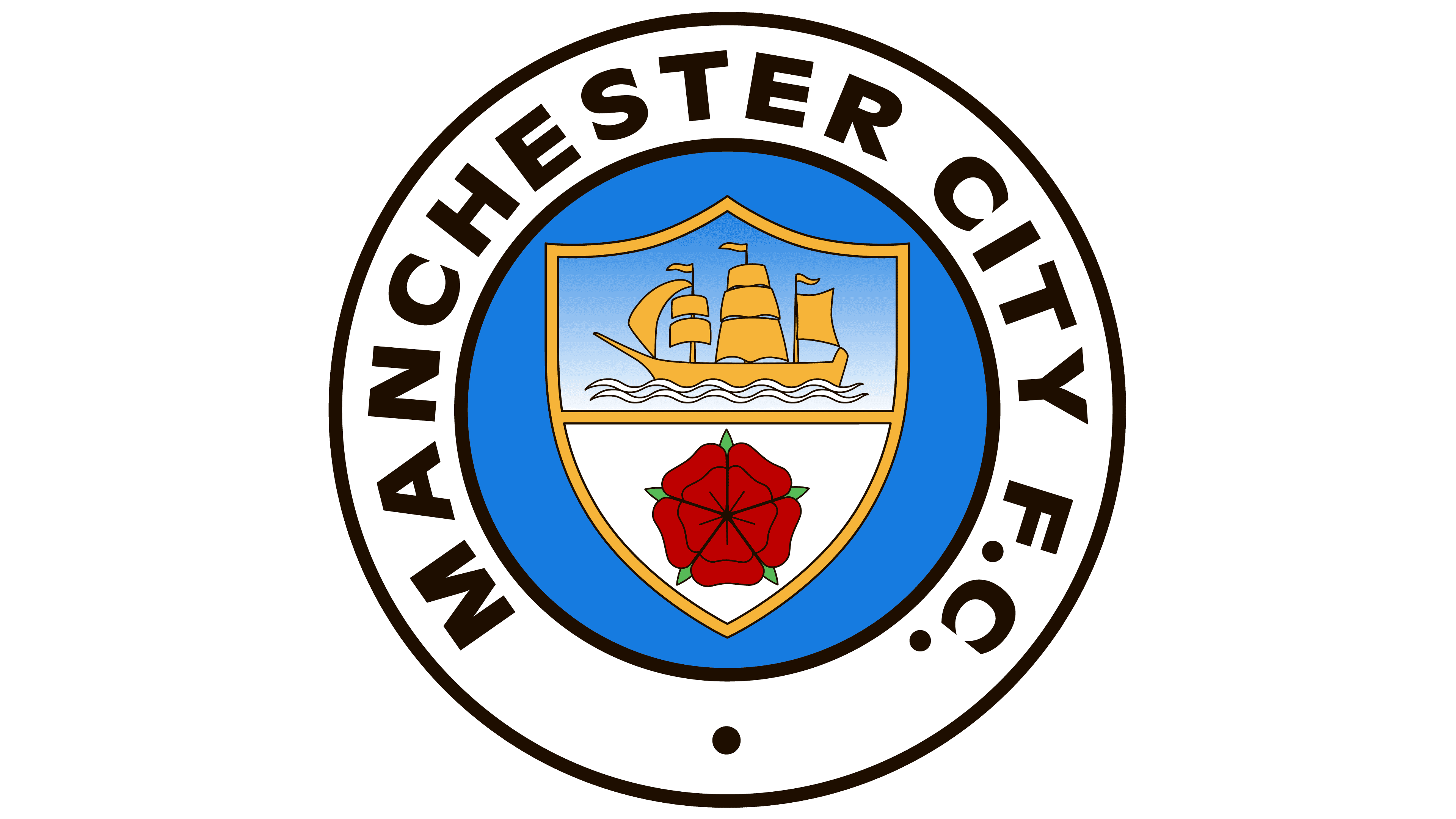
1997 – 2016
![]()
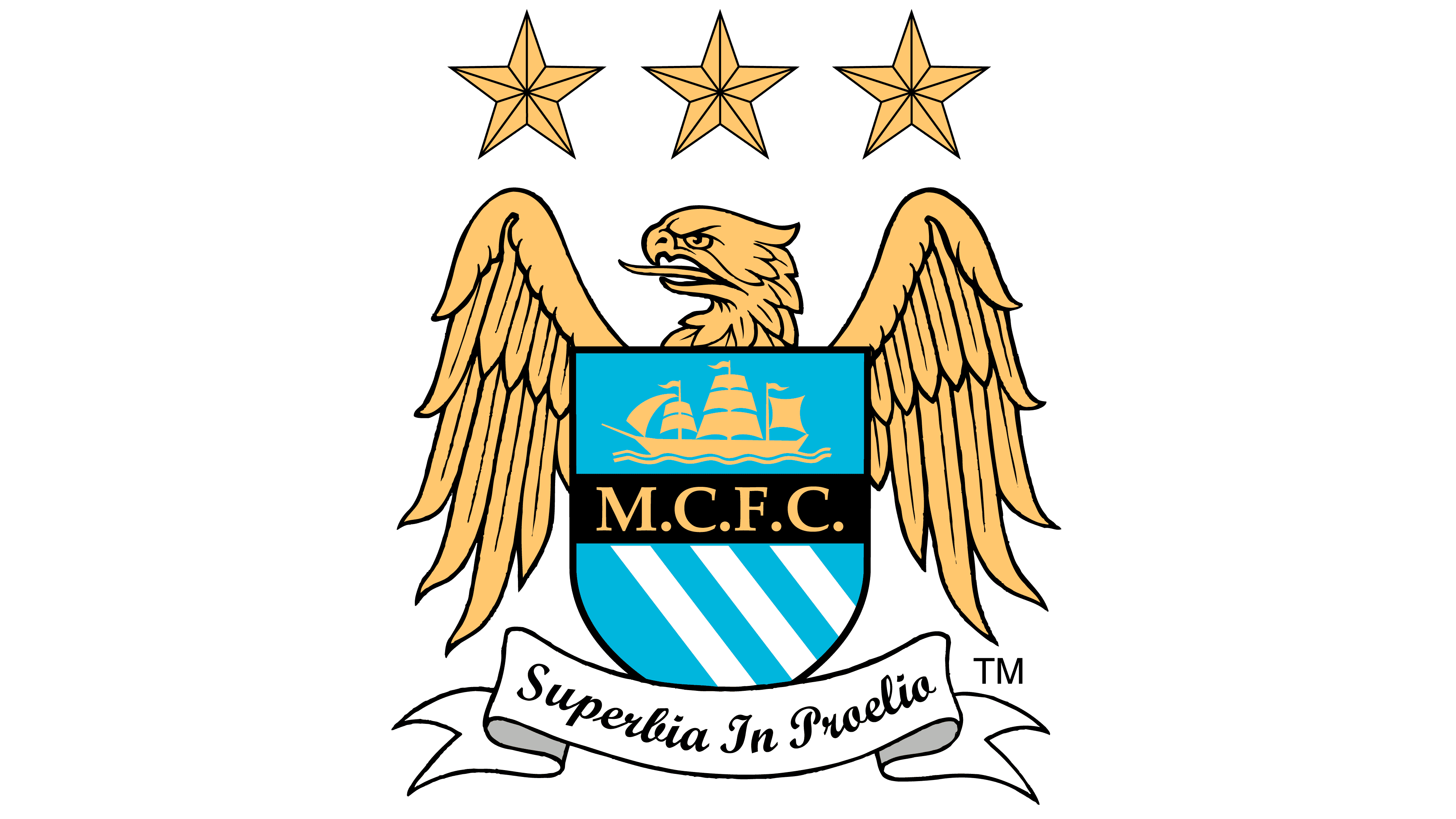
Due to accusations of copyright infringement, the club was forced to change its logo – the golden eagle – an old symbol of the city. Three white stripes on the shield symbolize the rivers Medlock, Irk, and Irwell. The motto “Superbia In Proelio” means “Pride in Battle.” Only three stars do not carry a hidden meaning – they perform a purely decorative function.
2016 – today
![]()
Due to numerous protests, “Manchester City” again decided to update the club badge. The announcement was published on October 15, 2015. Fans participated in creating the logo. Fans themselves chose the colors, shapes, and elements of the image. In the end, the emblem turned out to be the same as the one used before 1997. Only minor details changed: Three blue lines appeared on the background of the rose and the numbers “18” and “94,” indicating the club’s main date in history.
Manchester City: Interesting Facts
Manchester City Football Club has changed a lot and has a long story that goes back more than 100 years.
- How They Started: The team first came together in 1880 as St. Mark’s (West Gorton). They changed names a couple of times, becoming Manchester City in 1894.
- Old Home: Before 2003, they played at Maine Road for 80 years, which is a big part of their history.
- Wins: Manchester City has won many important games, including league titles and cups. They’ve also done well in international competitions.
- A Great Season: In the 2017-2018 season, under coach Pep Guardiola, they did something no other team had before: They scored 100 points in one season.
- New Owners: In 2008, a group from Abu Dhabi, led by Sheikh Mansour, bought the team, making Manchester City one of the richest teams in the world.
- Training and Youth: They’ve invested much money into their training facilities and a program for young players, showing they care about the future.
- Women’s Team: The Manchester City Women’s Team is also very successful, winning many trophies since it was started in 1988 and got a new look in 2014.
- Global Team: The owners have bought or invested in other soccer teams worldwide, making a big family of teams in different countries.
- Helping the Community: The team’s foundation in Manchester and other places supports health, education, and social projects.
- Big Rivalry: Their biggest rival is Manchester United. Games between them are a big deal and mean a lot to the fans.
Manchester City has grown from a local team to a big name in soccer worldwide, thanks to big dreams, smart investments, and hard work.
Font and Colors
Until 2016, the text on the heraldic shield was set in the contrasting font Palatino Bold, created by Hermann Zapf. The new logo uses its complete opposite. The name “Manchester City” is written in bold letters without serifs, and all strokes have the same thickness. This version roughly resembles Metropolis Bold by Chris Simpson.
To make the football club’s symbol bright and easily noticeable, the designers combined several colors:
- Dark blue (for letters and most contours);
- Two shades of light blue (for the diagonal stripes inside the shield, numbers, and some details);
- Red (for the petals of the rose);
- Two variations of gold (for the ship and inner contours of the shield).
- White color is used as a background for inscriptions and the sailboat.
Manchester City color codes
| Ruddy Blue | Hex color: | #6cabdd |
|---|---|---|
| RGB: | 108 171 221 | |
| CMYK: | 51 23 0 13 | |
| Pantone: | PMS 298 C |
| Delft blue | Hex color: | #1c2c5b |
|---|---|---|
| RGB: | 28 44 91 | |
| CMYK: | 69 52 0 64 | |
| Pantone: | PMS 655 C |
| Maximum Yellow Red | Hex color: | #ffc659 |
|---|---|---|
| RGB: | 255 198 89 | |
| CMYK: | 0 22 65 0 | |
| Pantone: | PMS 136 C |
| Goldenrod | Hex color: | #d4a12a |
|---|---|---|
| RGB: | 212 161 42 | |
| CMYK: | 0 24 80 17 | |
| Pantone: | PMS 7409 C |
| Cinnabar | Hex color: | #ec3325 |
|---|---|---|
| RGB: | 236 51 37 | |
| CMYK: | 0 78 84 7 | |
| Pantone: | PMS Bright Red C |