![]() New York Rangers Logo PNG
New York Rangers Logo PNG
Will, determination, and invincible strength are the key theses of the emblem of these hockey players, “New York Rangers.” To emphasize this concept, the designers proposed a heraldic-style emblem for the team. It is directly associated with knightly bravery – a shield with elements of a fortress wall on which the team’s name is written.
New York Rangers: Brand overview
| Founded: | 1926 |
| Founder: | Madison Square Garden Sports |
| Headquarters: | New York, U.S. |
| Website: | nhl.com |
“New York Rangers” is a professional hockey team based in New York. The franchise was founded in 1926 and has not changed its name throughout its history. The team’s founder was George Lewis Rickard, owner of Madison Square Garden. George Lewis Rickard (nicknamed “Tex”) was born in Kansas City, Missouri, but spent his green years in Texas, where his parents moved when he was still a child. New Yorkers owe Rickard the “Rangers” and their arena.
The economic boom of the 1920s in the USA led to rapid growth in the construction of offices, factories, and homes. Since the old “Madison Square Garden” was not a great financial success, the New York insurance company decided to demolish it to free up space for the new headquarters building. Rickard, a successful boxing promoter, managed to organize a syndicate to build a new arena with the old name.
Originally, the arena became home to “New York Americans,” or “Amerks,” the first professional hockey team in New York. Rickard wanted to get to know the new game and decide whether to invest his capital in it. The Amerks turned out to be stronger than expected, so Rickard decided to invest money in his team instead of promoting the “New York Americans.” In 1926, the National Hockey League granted George Rickard a new franchise. Soon, the “Americans” were eclipsed by the “New York Rangers,” who had long captured the hearts and minds of Manhattan residents.
Rickard had no agonizing doubts about the team’s uniform. As a true Texan, he understood that in such a metropolis as the Big Apple, there couldn’t be much patriotism, so the team’s color palette includes blue, white, and red, the colors of the American flag. Regarding the team’s name, journalists called it Tex’s Rangers. Tex’s Rangers sounds the same as Texas Rangers. The Texas Rangers division is an American law enforcement agency with jurisdiction in the state of Texas. Of course, the original name had nothing to do with New York, but the pun turned out quite funny.
The Rangers debuted in 1926 in blue uniforms with white and red stripes and a white “RANGERS” inscription diagonally. Their classic sweater has been used since the team’s foundation, undergoing several changes. The “Rangers” became the first American team to win the Stanley Cup. In the Stanley Cup final of 1928, the “New York Rangers” won against the “Montreal Maroons” with a score of 3:2.
The “Rangers” shield emblem has remained unchanged all these years, with minor changes in design.
Meaning and History
![]()
“New York Rangers” is one of the oldest professional hockey teams, fortunately possessing the aura inherent in the “Original Six” franchise. However, their logo remains surprisingly unchanged throughout their more than 90-year history. George Lewis Rickard proposed using a logo close to the symbolism of rivals – the New York Americans hockey team, which began performing at the same arena a year earlier. The version adopted in 1927 is still in use: it has undergone few changes, or rather, almost none. Having taken the form of a shield, it still looks that way. The franchise has eight versions of the logo.
What are New York Rangers?
It is an NHL team that represents the Metropolitan Division and performs in the Eastern Conference. The club was founded in 1926 and was the first to win the Stanley Cup. Then, it was honored with the main prize three more times, so in total, the franchise owns four cups, which were received in 1928, 1933, 1940, and 1994. It is the league’s senior and plays home matches at “Madison Square Garden.”
1927 – 1935
![]()
The first owner of the club was George Lewis Rickard, known as a boxing promoter and president of “Madison Square Garden.” The designer made the “New York Rangers” logo very similar to their rivals’ – “New York Americans.” It had the form of a shield and was executed in red, blue, and white colors. The inscription “New York” was located above the horizontal blue stripe at the top of the shield. The team’s name, “Rangers,” could be seen on a diagonal stripe. In the top left corner of the emblem was a red triangle, and in the bottom right – a white field.
1936 – 1947
![]()
In 1936, the team updated the color palette, making the shades of red and blue slightly darker and more noble. The inscription “Rangers” was written in red, not a white font. The logo was framed with an outer white border. Otherwise, this logo was identical to the first.
1947 – 1952
![]()
The 1948 redesign was more profound. The shades changed, and the shield itself took on a different shape – now its base was a rectangle. The “New York Rangers” logo was outlined with an outer blue frame.
1953 – 1967
![]()
In 1954, the “New York Rangers” logo became even closer to a rectangular structure. Unlike the previous version, the rectangle was positioned horizontally. The outer blue frame became thinner and bolder. However, there were no significant changes in the design.
1968 – 1970
![]()
During the 196-1978 period, the emblem’s word symbols were typed in a thinner font, the white space in the outer frame was reduced, and the overall shield looked a bit narrower, but these were the only differences. The team’s name, “New York Rangers,” was written in white font and remained in the same places.
1971 – 1977
![]()
In 1971, the “New York Rangers” emblem was updated again. Here, the font height in the words New York and Rangers was reduced. The color palette remained the same. The red triangle’s edging was replaced with white lines.
1978 – 1998
![]()
For thirty years, the “Rangers” logo did not change. The 1978 design changes were minor. The color palette was changed to lighter shades of red and softer blues. The shield and word symbols remained untouched.
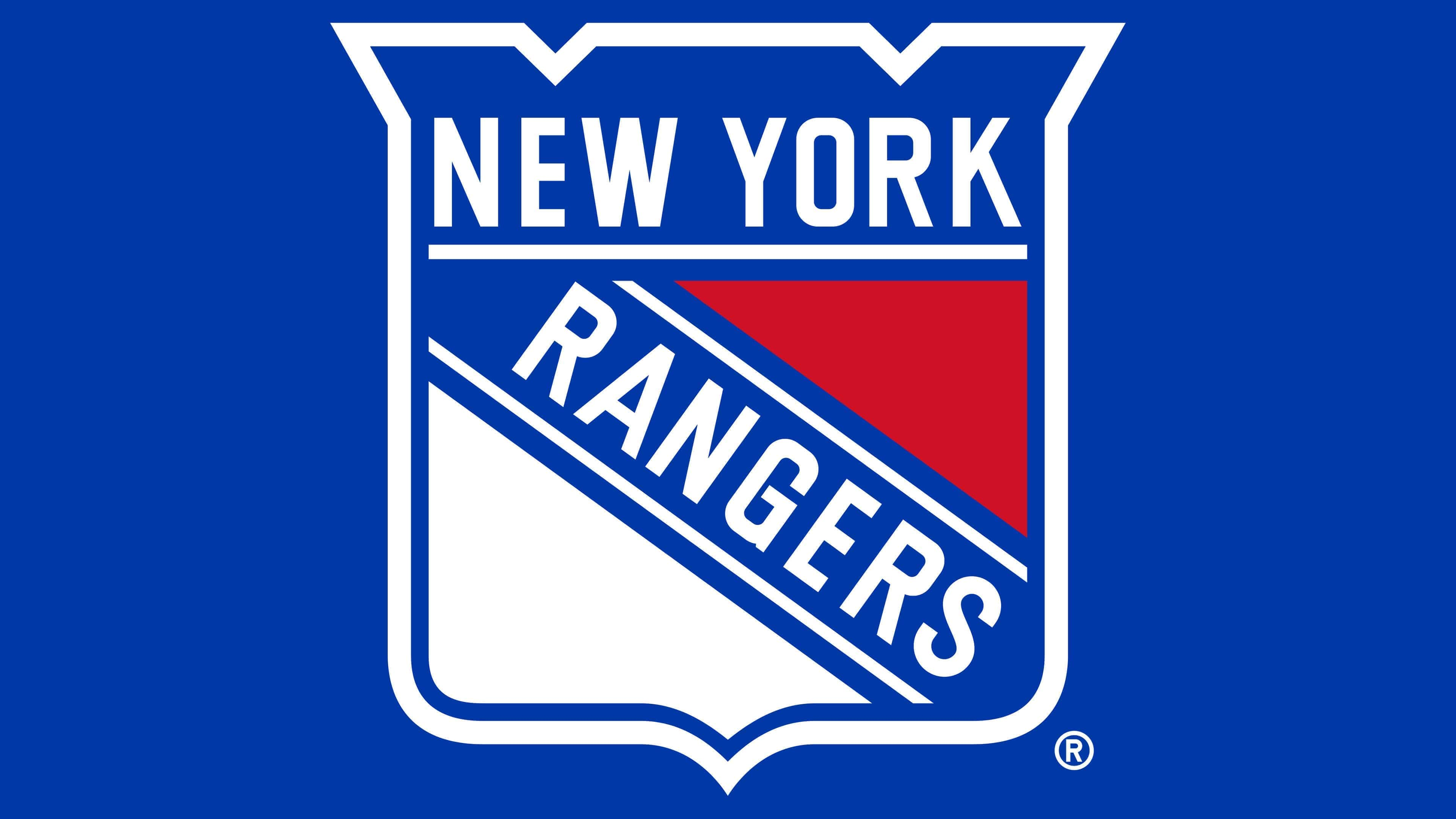
1999 – today
![]()
In 1999, the “New York Rangers” emblem was slightly updated. Its configuration became closer to a wide rectangle with elements of a medieval fortress wall. On the “defensive structure,” there are ornate recesses – the so-called “swallowtail” (an architectural term). This element emphasizes the club’s connection with history, its antiquity, and its inaccessibility to any rivals.
The main part of the logo is divided diagonally into three zones. At the top is a red triangle, in the middle – the word “Rangers,” at the bottom – a white element, close in shape to a triangle. Above them, the inscription “New York” is punched out in white. Two stripes run along the perimeter of the sign – a wide white and a thin blue one.
New York Rangers: Interesting Facts
The New York Rangers are an old and famous ice hockey team in New York City. They’ve been around for a long time and have had some cool moments.
- Original Six: The Rangers are one of the first six NHL teams, starting in 1926. That makes them one of the oldest teams around.
- Winning the Big Trophy: The Penguins have won the Stanley Cup several times, a huge deal in hockey. Their first win was in 1928, and they won again in 1933, 1940, and 1994 after waiting for 54 years.
- A Long Wait: Before winning in 1994, they hadn’t won the Stanley Cup for 54 years, which some people called the “Curse of 1940.” They tried hard many times but just couldn’t win it until then.
- Their Home: They play games at Madison Square Garden, a famous place in New York known for being an exciting place for hockey.
- Wayne Gretzky: A great player known as “The Great One,” finished his career with the Rangers. He played his last game there and is the top scorer in NHL history.
- Honoring Players: The Rangers have honored some of their best players by not letting anyone else use their numbers, like Rod Gilbert’s #7 and Mark Messier’s #11.
- Dedicated Fans: The Rangers’ fans love their team and make a lot of noise at their games, showing lots of support.
- First in the U.S.: They were the first team in the United States to win the Stanley Cup back in 1928, which made hockey more popular in the country.
- Big Rivalries: The New York Islanders and the New Jersey Devils are big rivals because they’re all from the same area. These games are always super exciting.
The New York Rangers have a big place in hockey history with their early wins, long times without winning, and finally getting back to winning. They’re a big part of New York City’s sports world.
Font and Colors
The first two versions of the “New York Rangers” logo resembled a knight’s shield with an element of a royal crown at the top. But in 1947, the designers changed its shape, making it much wider, so it resembled the heraldic sign of some famous dynasty. The structure of the emblem remains standard for several decades in a row. Its content does not change: any corrections are related to the evolution of the form of the “fortress wall” at the top and the change of red and blue shades.
The inscriptions are executed in a sans-serif font series. The letters are chopped, smooth, grotesque. They are spaced at an optimal distance from each other – the gap between them is not narrow but not wide, just right for visual perception of the name. In addition, the word “Rangers” is positioned diagonally and reads from top to bottom.
The logo contains all the team’s official colors. One of them is white. It is used for the bottom triangle, inscription, and border. The other two are from the hex category: red #C8102E (top triangle) and blue #0038A8 (background for words and outlines).
New York Rangers color codes
| Blue | Hex color: | #0033a0 |
|---|---|---|
| RGB: | 0 51 160 | |
| CMYK: | 100 75 0 0 | |
| Pantone: | PMS 286 C |
| Red | Hex color: | #c8102e |
|---|---|---|
| RGB: | 200 16 46 | |
| CMYK: | 2 100 85 6 | |
| Pantone: | PMS 186 C |
FAQ
What does the “New York Rangers” logo represent?
The “New York Rangers” logo is a rectangular shield with a point at the bottom. It was approved in 1927 and has hardly changed since. It includes elements of a fortress wall, the club’s name, stripes, and two triangles. All are executed in a wide frame and colored in blue, red, and white.
Why are they called “New York Rangers”?
They are so named because of the play on words that journalists introduced at the very beginning of the franchise’s formation. The fact is that its founder is Tex Rickard. Therefore, the hockey players received the nickname Tex’s Rangers, which eventually turned into Texas Rangers.
Do the “New York Rangers” exist?
Yes, the “New York Rangers” exists to this day, despite the fact that there is another hockey team in the city. They are the oldest expansion franchise in the NHL.
When were the “New York Rangers” founded?
This team is at the origins of American hockey: it was founded in 1926 as an NHL expansion franchise. The club reflected its antiquity in the logo in the form of an ancient and impregnable fortress wall, turned into a shield.