![]() Philadelphia Union Logo PNG
Philadelphia Union Logo PNG
The corporate style of the American soccer club Philadelphia Union, its logo, and its team name reflect America’s colonial history. The 13 stars represent the 13 colonies. The image of the snake is a tribute to B. Franklin and the national revolutionary symbol of 1754.
Philadelphia Union: Brand overview
| Founded: | February 28, 2008 |
| Founder: | Jay Sugarman |
| Headquarters: | Chester, Pennsylvania, Philadelphia, U.S. |
| Website: | philadelphiaunion.com |
Philadelphia Union is an American professional soccer team based in Chester, Pennsylvania, in the Philadelphia statistical area. The club began playing in 2010 as a league expansion team. The team competes in Major League Soccer (MLS) as a member of the league’s Eastern Conference.
Major League Soccer added Philadelphia as its sixteenth team on February 28, 2008. MLS transferred the franchise to Keystone Sports & Entertainment. The club’s creation resulted from a $47 million project approved by Delaware County politicians and the Governor of Pennsylvania, which included the cost of the “Talen Energy” stadium and a major city reconstruction project.
For most of 2008 and early 2009, the club operated under the name MLS Philadelphia 2010. The name was chosen as a result of a fan poll conducted from January 19, 2009, to February 6, 2009. Four options were offered to fans: “Philadelphia Union,” “Philadelphia City,” “SC Philadelphia,” and “AC Philadelphia.” On May 11, 2009, the city’s mayor officially announced the club’s name, “Philadelphia Union,” at a ceremony held at Philadelphia City Hall.
The name “Philadelphia Union” reflects America’s rich colonial history. It’s a reminder of the union of thirteen British colonies that declared independence and formed the USA. Philadelphia was the first capital of this union. It’s no surprise that the team’s colors are navy blue and gold, symbolizing the main colors of the Continental Army’s uniform during the American Revolutionary War.
Keystone Sports & Entertainment owns the Philadelphia Union. Nick Sakiewicz led the group of owners until October 2, 2015, when he left due to strained relations with the Union’s fanbase. His position was taken over by Jay Sugarman, CEO of iStar Financial. Other investors included David Seltzer, Richard Leibovitch, Joseph J. Greco, David B. Pollin, Robert Buccini, and Christopher F. Buccini.
Meaning and History
![]()
Since 2010, the club has had two logos, differing only in color. They resonate with the name “Philadelphia Union” as they contain graphic references to Philadelphia’s past. They reflect the history of US independence and key national symbols.
What is Philadelphia Union?
Philadelphia Union is a professional soccer club from the USA based in Philadelphia. It competes in MLS and is part of the Eastern Conference. The club was founded in 2008 and began playing as an expansion franchise in 2010. The club’s first prestigious achievement was winning the Supporters’ Shield. The primary owners of the club are Jay Sugarman (Chairman of the Board of Directors) and Kevin Durant.
2010 – 2017
![]()
The first logo of “Philadelphia Union” was introduced on February 28, 2008. Its circular shape symbolizes national unity. The navy blue ring features 13 gold stars, each symbolizing one of the 13 American colonies. At the center of the logo is an English heraldic shield with two cups at the top. The same shield is depicted on Philadelphia’s flag and seal.
A horizontal line runs through the shield, below which is depicted a rattlesnake. The venomous reptile coils up and sticks out its forked tongue. This is a tribute to Benjamin Franklin’s political cartoon published on May 8, 1754. The rattlesnake became a national symbol during the American Revolution, embodying the danger of disunity. It was a national symbol of the Union of Thirteen Colonies and is depicted on the Gadsden flag.
The “Philadelphia Union” logo uses the official colors of the Union – gold and navy blue, symbolizing the main colors of the Continental Army’s uniform during the American Revolutionary War. The light blue color in the center of the crest is a tribute to “Ben’s Sons” and originates from the civic flag of Philadelphia. Coincidentally, the navy blue, gold, and light blue colors of the Union are also the dominant colors of the flags of the states of Pennsylvania, New Jersey, and Delaware.
At the top of the Union’s emblem are two words: “Philadelphia” on the wide ring with stars and “Union” on the heraldic shield. The font of the first word is stylized with round cutouts, while the font of the second is geometric without cutouts.
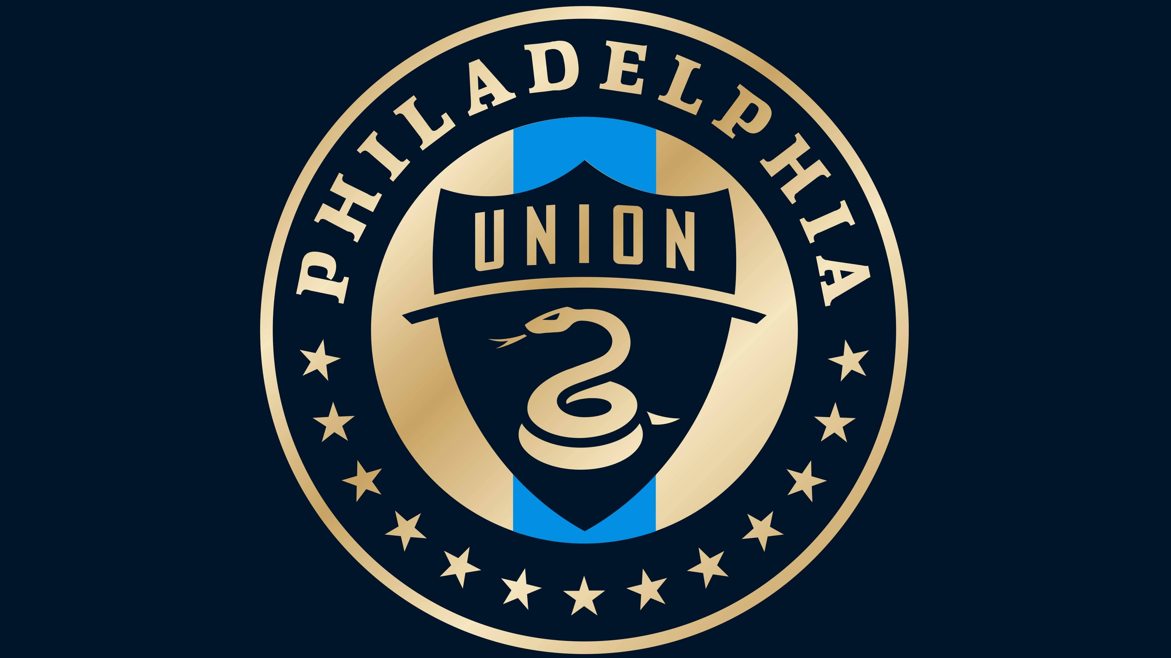
2018 – today
![]()
In 2018, the team changed its logo at the initiative of design manager Sean Cryder and Vice President of Marketing Doug Vosik. As the “Union” entered its ninth season, Sean Cryder knew that fans wanted change and a new approach to the classic “Philadelphia Union” logo. Designers simplified the look: removed the central white ring and replaced the gold and navy blue colors with new, brighter, and more saturated shades. They also added an entirely new gold gradient. The blue outlines in the center disappeared – the logo now has only one lone blue stripe in the center. The shapes and geometry of the other elements remained the same.
Philadelphia Union: Interesting Facts
The Philadelphia Union is a soccer team that many people like because it strongly connects to the city and the people living there. They started playing in the Major League Soccer (MLS) in 2010.
- How They Started: They became a part of the MLS in 2008, and their name, “Union,” shows how important teamwork and history are to the United States, especially in Philadelphia, where much of American history happened.
- Where They Play: Their games are at Subaru Park in Chester, Pennsylvania. This place is next to the Delaware River and can hold over 18,000 fans. It looks cool because it’s designed to remind people of the area’s history with making things and building bridges.
- Fans: Their biggest fan group is the “Sons of Ben,” named after Benjamin Franklin. This group even started before Philadelphia had a soccer team, showing how much people wanted one. They’re a big reason the team exists.
- Team Symbols: Their badge and colors (navy blue and gold) have a lot of local history, like a rattlesnake and a shield on the Continental Army’s uniforms, and thirteen stars for the original states.
- Big Wins: In 2020, they won their first big trophy, the Supporters’ Shield, for being the best team during the regular season.
- Young Talent: They’re good at training young players in their academy, and some have become very important to the team.
- Famous Players: Players like Sébastien Le Toux, the team’s top scorer, and Alejandro Bedoya, the captain, have made big contributions.
- Helping Out: The team does a lot to help out in the community, such as through health programs, helping kids, and charity work through the Union Foundation.
- Traditions: After winning a game at home, the team rings the “Liberty Bell” in the stadium to celebrate with the fans.
- Cool Partnerships: They partnered with Dogfish Head Brewery to make a special “Union Ale” beer for their fans.
The Philadelphia Union is loved for focusing on their local roots, helping the community, and bringing up new talent, making them a key part of Philadelphia and a strong team in the MLS.
Font and Colors
Despite the importance of all elements of the “Philadelphia Union” logo, the main one has always been the rattlesnake. The reptile coiled inside a triangular shield, sticking out its forked tongue. It exudes calmness, as its goal is not to frighten the football club’s opponents but to demonstrate the need for national unity.
The snake is significant for the Union of Thirteen Colonies: it’s interpreted as a symbol of the danger that can arise from disunity. By the way, the colonies themselves are also represented on the emblem. These are the thirteen stars in the lower half of the circular frame.

Designers developed an original style for the logo and font for the inscriptions. And not one, but two: the first for “PHILADELPHIA,” the second for “UNION.” The letters in the name of the city are bold and geometric, with large serifs and rounded corners. The font used for the word “UNION,” on the contrary, does not contain serifs. The characters in it are thinner but still bold.
The first version of the emblem uses four symbolic colors: Navy Blue (#002D55), Metallic Gold (#B38707), Signal Blue (#5090CD), and Flat Gold (#B49759). The first two match the colors of the Continental Army’s uniform, while the third represents the city of Philadelphia’s flag. After the redesign, the shades changed slightly: the gold became lighter, the blue darker, and the light blue brighter.
Philadelphia Union color codes
| Navy Blue | Hex color: | #071b2c |
|---|---|---|
| RGB: | 7 27 44 | |
| CMYK: | 84 39 0 83 | |
| Pantone: | PMS 296 C |
| Gold | Hex color: | #b19b69 |
|---|---|---|
| RGB: | 177 155 105 | |
| CMYK: | 0 12 41 31 | |
| Pantone: | PMS 7562 C |
| Signal Blue | Hex color: | #3e8ede |
|---|---|---|
| RGB: | 62 142 222 | |
| CMYK: | 72 36 0 13 | |
| Pantone: | PMS 2925 C |