![]() Porto Logo PNG
Porto Logo PNG
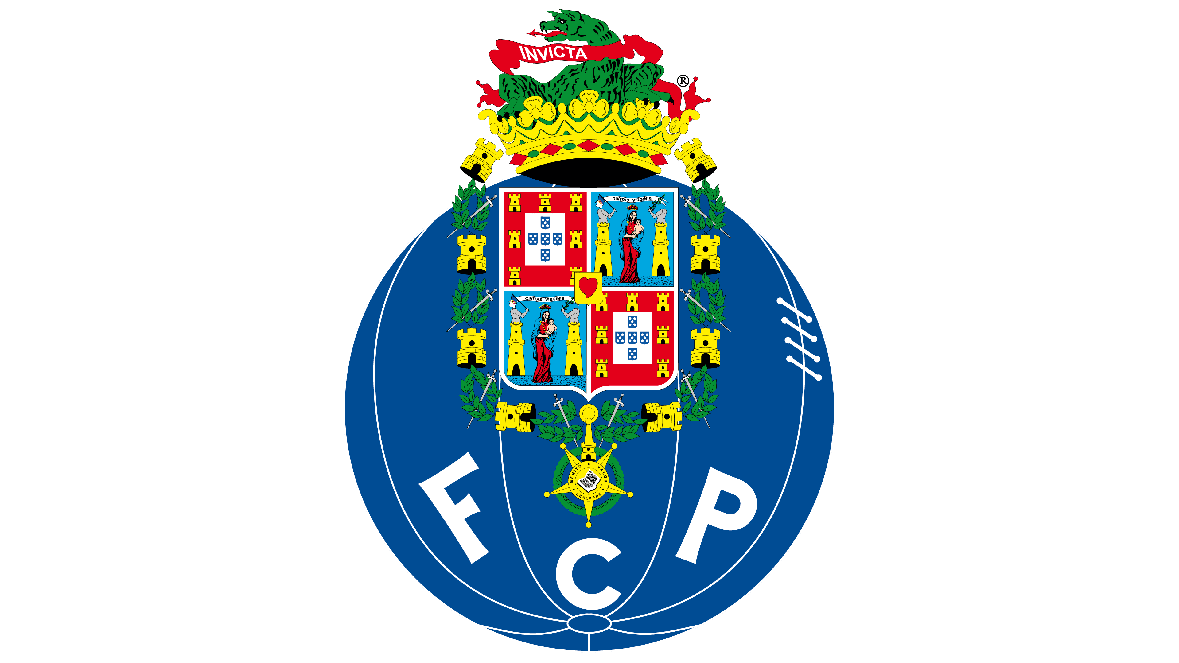
The “Porto” logo, the most famous Portuguese club, is colorful and full of elements. The primary colors are borrowed from the royal house, and the heraldry symbolizes commitment to the country and its history. Ferocity, strength, and power reflect the dragon. The emblem of the football club “Porto” is filled with a vast number of elements. Here, you can see a tower, a dragon, and the Virgin Mary. But in reality, it’s not as complicated as it might seem at first glance.
Porto: Brand overview
| Founded: | 28 September 1893 |
| Founder: | Antonio Nicolau de Almeida |
| Headquarters: | Porto, Portugal |
| Website: | fcporto.pt |
On September 28, 1893, one of the most popular football clubs in Portugal was founded by a merchant who was involved in exporting port wine to England. However, the foundation day was not chosen randomly: in fact, September 28 is the birthday of the then-reigning King of Portugal, Carlos I, and his wife, Amelie, who was born on the same day. As for the colors, the blue and white tones of Porto were official for the royal house of Portugal. The king and his spouse were invited to the very first match of the newly formed team.
Meaning and History
![]()
The “Porto” logo was quite simple. It consisted of a blue and white football, more resembling a globe (notice the unique “meridians”), at the center of which was the abbreviation FCP. The only significant rebranding was conducted in Porto in 1922. To the team’s emblem were added the coat of arms of the city of Porto (an image of the Virgin Mary) and the coat of arms of Portugal (with the towers of the castle on it). All this is also framed by the coat of arms of Portugal – eight Moorish castles that Portugal conquered during the Reconquista.
However, the most significant change to the logo was the addition of the inscription Invicta (invincible) and the image of a dragon. Since then, port wine has been nicknamed “dragons.” Overall, despite the accumulation of elements in the logo, there aren’t that many: two emblems, an inscription, and a dragon. Surprisingly, the logo has not undergone noticeable changes since then. Many designers offer Porto new versions of the emblem, but the leaders of the “dragons” refuse all proposals. Some of them look very stylish and modern!
But the leaders and fans of “Porto” are too conservative to change their already established emblem for a new and stylish one.
What is Porto?
Porto is the abbreviated name of the Portuguese professional football club FC Porto. Located in the eponymous city, the club was founded in 1893 by Antonio Nicolau de Almeida. Over time, the team advanced to the top division (Primeira Liga) and became the second-most trophy-winning club in the country, having won 83 trophies. The team’s home stadium is Estadio do Dragao.
1893 – 1896, 1906 – 1910
![]()
No one knows precisely when the first logo of the football club, “Porto,” appeared. It is only known that at the time of the club’s foundation (1893), it did not exist yet – it was developed only in the 20th century. Most sources point to 1900 as the correct date. The debut graphic symbol consisted of a white monogram and a dark blue circle. These colors were chosen because they symbolize calmness and peace. The intertwined letters “F,” “C,” and “P” were taken from the full name of the Portuguese team: Futebol Clube Porto.
1910 – 1922
![]()
In 1910, the logo was simplified: the original monogram turned into a standard abbreviation, and the circle turned into a football. This allowed indicating the initials of the club and denoting the sport in which it performs.
1922 – 1995
![]()
Twelve years later, a very complex emblem replaced the simple one. It was developed by one of the players – Augusto Baptista Ferreira. The footballer, who was also a decent artist, combined the previous graphic symbol with state symbolism after a board of directors meeting. To do this, the ball had to be flipped, and the letters “FCP” moved down to make room for new elements.
The top part of the logo was occupied by two coats of arms: of the city of Porto and the state of Portugal. The designer didn’t just copy them – he combined different symbols into one drawing. The long chain of wreaths, towers, and swords taken from the city’s coat of arms is a special national award. On the football team’s emblem, it frames a rectangular shield divided into four parts. On two of them, Maria with baby Jesus is depicted, and on the other two – the royal coat of arms.
Above is a crown, which at that time was a symbol of the city of Porto. Right inside it sits a green dragon. The mythical creature holds a ribbon with the Latin inscription “INVICTA” (translated as “unconquered”).
1995 – 2002
![]()
The legendary emblem was so liked by the club’s management that they decided not to change it even after 70 years. Artists just added bright colors and depicted the Virgin Mary in a more human guise instead of a statue. The dragon also began to look different, as gradients were no longer used in the design. The letters in the lower part of the sphere acquired weak serifs.
2002 – 2010
![]()
At the beginning of the 21st century, the FC Porto logo was modernized again. Designers changed the color of the towers and crown: if before they were richly yellow, now they became orange. As a result, the picture does not seem too bright. The dragon remained, although it had long disappeared from the city’s coat of arms. A small orange flame bursts from the mouth of the fire-breathing creature.
2010 – 2017
![]()
In 2010, an attempt was made to modernize the crest. For this, artists used new color design techniques. As a result, the football gained a blue gradient, making it look voluminous. The smooth transition from dark orange to light orange gave the crown a shimmer.
The dragon is also painted in several shades of green, which was not seen before. The five-pointed star above the letter “C” is now entirely orange – the bright yellow color has completely left the logo. In addition, designers added blue shadows to some elements: this applies to towers and wreaths around the shield.
2017 – today
![]()
After another redesign, the football was darkened. At the same time, the invisible light source shifted: before, the bright spot was right in the center; now, it is slightly to the right.
Porto: Interesting Facts
FC Porto is a famous soccer club from Portugal.
- Beginning: They started way back on September 28, 1893. That makes them one of the oldest soccer teams in Portugal. They’ve always been all about playing great soccer and winning.
- Winning at Home: They’ve won many Primeira Liga titles. Along with SL Benfica and Sporting CP, they’re one of Portugal’s top soccer teams. Their matches are super exciting, and many people love watching them play.
- European Wins: They won the UEFA Champions League twice, once in 1987 and again in 2004. These wins showed everyone that Portuguese soccer is good.
- More European Success: They also won the UEFA Cup/Europa League, which means they’re great at playing against teams from all over Europe, not just Portugal.
- Dragon Stadium: They have a cool stadium called Estádio do Dragão, which opened in 2003. It’s an awesome place for soccer, and it’s named after their nickname, the “Dragons,” which stands for being strong and never giving up.
- Young Players: They’re good at training young soccer players who go on to star in Portugal and other countries. It’s a big part of their work.
- Pinto da Costa: He’s been the club’s boss since 1982. Under his leadership, the club has won a lot and become financially stable.
- Famous Players: Many great soccer players, like Deco, Ricardo Carvalho, and Radamel Falcao, have played for Porto. They’re part of what makes the club so good.
- Coaching: They’ve had some smart coaches, like José Mourinho, who helped them win many games and trophies, including the UEFA Cup and Champions League right after each other in 2003 and 2004.
- Fans All Over: Their exciting soccer has won them fans worldwide. They play in Europe and travel for matches, making them popular.
So, FC Porto is not just a soccer team; they’re a big deal in Portuguese and European soccer, known for winning, training young talent, and having fans everywhere.
Font and Colors
The FC Porto emblem interestingly plays with the country’s and city’s primary symbols. They are combined with the old graphic sign of the team, which until 1922 depicted a ball with the inscription “FCP.” Almost a hundred years have passed since the appearance of the original emblem. During this time, the “Porto” coat of arms changed: the dragon disappeared from it in 1940. But the club decided to leave this historical image in its usual place.
As a result, the dragon, as many years ago, languidly lies inside the crown and holds a ribbon with the inscription “INVICTA.” Perhaps such conservatism is related to the fact that the home stadium of the footballers is called Estádio do Dragão, and they themselves are nicknamed Dragões.
The abbreviation “FCP” is unremarkable: it is written in a standard font without serifs. Designers focused not on the lettering but on the graphic part, so they chose a combination of five primary colors: blue (#00428C), white (#FFFFFF), red (#D60019), green (#009634), and gold (#E9B245). Each of them, except white, has several gradient shades.
Porto color codes
| Midnight Blue | Hex color: | #00428c |
|---|---|---|
| RGB: | 0 66 140 | |
| CMYK: | 100 53 0 45 | |
| Pantone: | PMS 7687 C |
| Lava | Hex color: | #d60019 |
|---|---|---|
| RGB: | 214 0 25 | |
| CMYK: | 0 100 88 16 | |
| Pantone: | PMS Bright Red C |
| Irish Green | Hex color: | #009634 |
|---|---|---|
| RGB: | 0 150 52 | |
| CMYK: | 100 0 65 41 | |
| Pantone: | PMS 354 C |
| Maximum Yellow Red | Hex color: | #e9b245 |
|---|---|---|
| RGB: | 63 194 204 | |
| CMYK: | 60 0 23 0 | |
| Pantone: | PMS 143 C |