![]() Sunderland Logo PNG
Sunderland Logo PNG
Despite lacking elements associated with movement and speed, the “Sunderland” logo appears dynamic. This is thanks to its irregular shape, where sharp angles and soft curves harmoniously combine. The emblem’s symbolism is also expressive: the designers used images from the city’s glorious history, where the football club is based.
Sunderland: Brand overview
| Founded: | 1879 |
| Founder: | Kyril Louis-Dreyfus |
| Headquarters: | Sunderland, England |
| Website: | safc.com |
The club was founded by a teacher named James Allan in 1879. Its name was fitting: “Teachers of Sunderland and Surrounding Areas.”
The Penshaw Monument, as an element of the “Sunderland” logo, expresses support from fellow countrymen far beyond the city. This monument is dedicated to the Briton John Lambton, who became the first Governor-General of the united Canada in 1838. The name of the Penshaw area translates to “wooded hill.” Legend has it that once a giant worm lived here, devouring not only livestock but also people until a crusader named John Lambton dealt with the dangerous creature.
Meaning and History
![]()
The football club borrowed lions from the city’s coat of arms of Sunderland. However, the team’s nickname is different – black cats. This was the name of an artillery battery located in these parts at the beginning of the 19th century. The club’s nickname was cemented in 1937 when a 12-year-old fan, Billy Morris, brought a black kitten in his pocket to the FA Cup final against “Preston.” Then “Sunderland” won – 3:1.
The wheel depicted on the “Sunderland” logo is a tribute to the city’s mining traditions. The “Stadium of Light” club was built just when the region had one of the largest coal mining enterprises, which lasted until 1993.
The phrase “Consectatio Excellentiae” on the “Sunderland” logo means “pursuit of excellence”.
In the lower right corner of the logo’s shield is the Wearmouth Bridge, connecting the northern and southern parts of the 175-thousand Sunderland. It was opened in 1929 by the Duke of York, the future King George VI.
“Sunderland AFC,” founded in 1879, received its debut logo only in 1905. The emblem featured a black cat because the team was then known as “Black Cats.” Originally, this was the name of an artillery gun from the 1800s located on the banks of the River Wear. However, after a few years, the players abandoned this symbol.
What is Sunderland?
Sunderland is a football club from the northeast of England and the main rival of Newcastle United. It has a rich history, dating back to 1879, and has won many major victories over a century and a half. The club competes in the English Football League Championship.
1913 – 1937
![]()
The emblem is made in a heraldic style. The main elements of the emblem are a white shield, feathers, leaves, a globe, a knight’s helmet, and a ribbon with the motto “Nil Desperandum Auspice Deo”, borrowed from the city’s coat of arms.
1937 – 1966
![]()
In 1937, the team changed the design of the logo. Now, the shield became blue, surrounded by two lines: red and white. Below is the inscription “1936-37”.
1966 – 1973
![]()
For seven years, the club used an emblem with the letters “S” (above) and “AFC” (below). This is an abbreviation of the full name of the football club, “Sunderland Associated.” The color is scarlet on white. The font is sans-serif.
1973 – 1977
![]()
The abbreviation “SAFC” on the logo is written diagonally. Black letters stand out against a red rectangle.
1977 – 1991
![]()
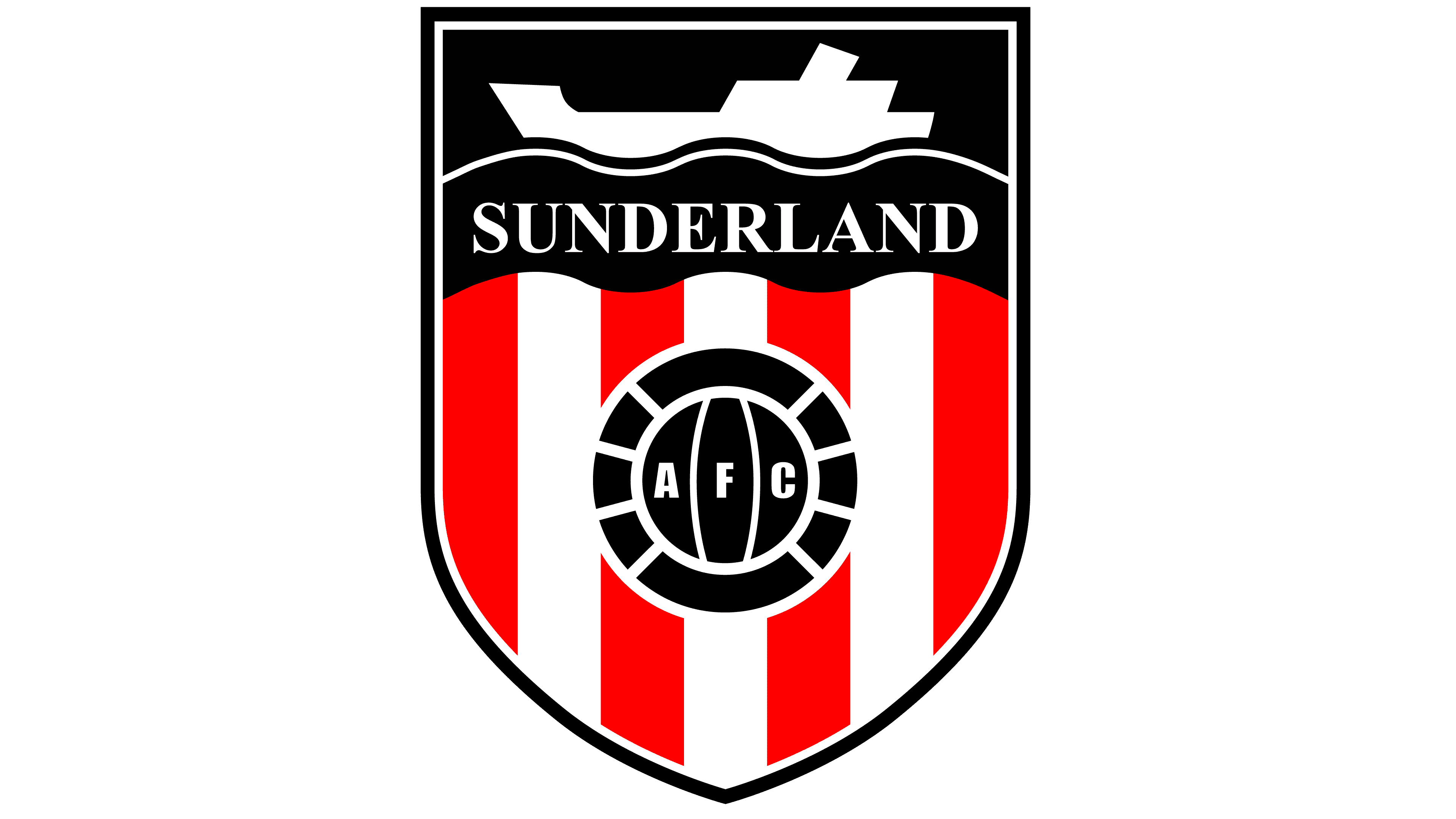
In the late 1970s, the designers updated the logo. The quadrilateral shield with a sharp base and a black outline is divided into two parts. Above on a blue background is a boat because Sunderland is a port city. Below is a ball with the inscription “A F C.” Behind it are red and white stripes taken from the team’s home kit.
1991 – 1997
![]()
In 1991, the upper part of the shield was repainted black. The overall concept remained unchanged.
1997 – today
![]()
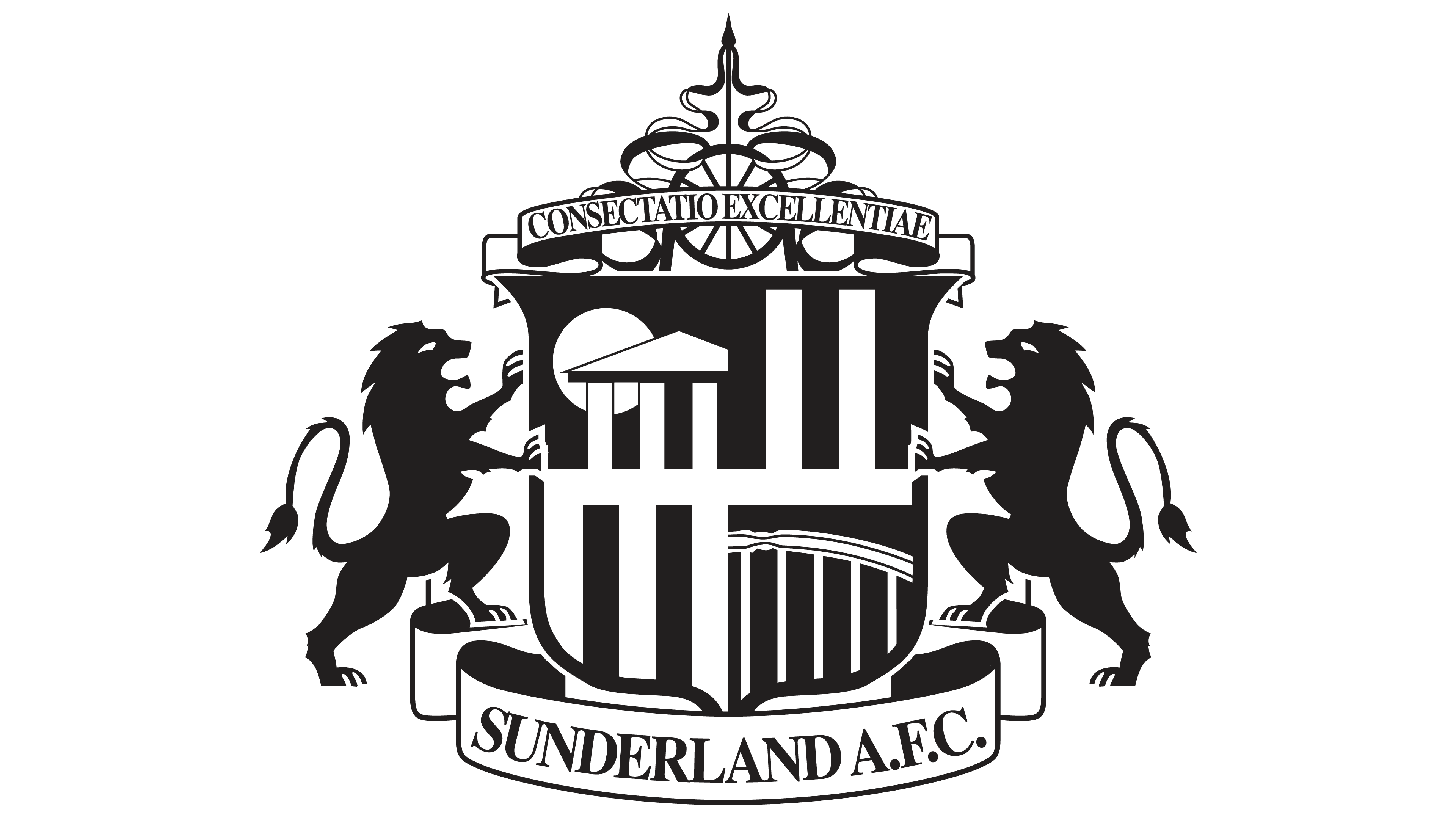
In 1997, the club marked the move to the “Stadium of Light” with a new emblem. In the center is a shield divided into four parts. In the lower right corner is the famous Wearmouth Bridge, connecting the southern and northern parts of the city. On the left is the Penshaw Monument. On the sides are two black lions, as on Sunderland’s coat of arms. Below the ribbons is the full name of the team.
Above the shield is the motto “Consectatio Excellentiae” (“Pursuit of Excellence”). Also depicted is a wheel, symbolizing the dungeon. It’s a tribute to the coal industry of County Durham and a reminder that the “Stadium of Light” was built on the site of the old Monkwearmouth coal mine.
Sunderland: Interesting Facts
Sunderland Association Football Club is a famous soccer team with a lot of history and loyal fans.
- How It Started: A schoolteacher named James Allan started the club in 1879. They first played at Blue House Field in Hendon.
- Their Stadium: Since 1997, they’ve played at the Stadium of Light. It got its name to honor the area’s coal mining past and the spirit of the people there.
- Nickname: They’re known as “The Black Cats.” This name comes from stories like a gun battery named after a black cat in 1805 and a black cat mascot in the 1960s.
- Wins: Sunderland has won the English League Championship six times, with the first win in 1892 and the last in 1936.
- FA Cup Wins: They’ve won the FA Cup twice, in 1937 and 1973. The 1973 win was special because they were not expected to win, but they beat one of the top teams, Leeds United.
- Big Crowds: The most people ever to watch a Sunderland game at home was 75,118 in 1933 during a big match.
- Roker Roar: At their old stadium, Roker Park, the fans had a famous loud cheer called the “Roker Roar.”
- Ups and Downs: Sunderland has had good times and bad times, moving up and down between the top soccer levels.
- Youth Program: They’re known for training young players well at the Academy of Light.
- Big Rivalry: They have a huge rivalry with Newcastle United. Games between them are a big deal and exciting.
Sunderland’s story includes big wins, strong community ties, and being a big part of soccer history.
Font and Colors
The “Sunderland” football club has its own vision of what the ideal logo should look like. Therefore, its graphic symbol is more like the city’s coat of arms, containing all the classic elements:
- A fancy shield
- Two heraldic lions on the sides
- Even a ribbon with a Latin motto.
In addition, there is another ribbon at the bottom – with the name of the team. The shield also contains a whole range of symbols – from images of architectural landmarks to references to the historical past of the city.
“Sunderland” has been using the same font since 1977. It can be classified as a classic Antiqua font, as all letters have short perpendicular strokes at the ends.
White and red are the primary colors of the team. They are also present on the emblem, where the central place is occupied by a red and white shield with ribbons. The lions are entirely black, in the best heraldic traditions. Beige and dark gold shades are also present.
Sunderland color codes
| Sand | Hex color: | #d1bf7f0 |
|---|---|---|
| RGB: | 209 191 127 | |
| CMYK: | 0 9 39 18 | |
| Pantone: | PMS 616 C |
| Spanish Red | Hex color: | #eb172b |
|---|---|---|
| RGB: | 227 212 173 | |
| CMYK: | 0 4 20 7 | |
| Pantone: | PMS Bright Red C |
| Black | Hex color: | #000000 |
|---|---|---|
| RGB: | 0 0 0 | |
| CMYK: | 0 0 0 100 | |
| Pantone: | PMS Process Black C |
| Dark Goldenrod | Hex color: | #a68a26 |
|---|---|---|
| RGB: | 166 138 38 | |
| CMYK: | 0 17 77 35 | |
| Pantone: | PMS 7556 C |